I love styrofoam printing and had so many ideas for this unit on architecture with 2nd Grade!
We started by talking about famous buildings we know from our city and looking at other iconic examples of architecture from around the world. It is really neat to teach this group of TCKs. Many of them have traveled a lot in their young lives and have been to visit some of the places I showed… Needless to say, the unit introduction took a while as they all had travel stories to share!
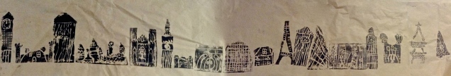
I had the students complete two drawings of buildings- inspired from printed out images or their own ideas. Then they chose one drawing to redraw on a piece of styrofoam and cut out. The next class I demonstrated how to make a print and called them three at a time to a station at the back to make three prints. *While we were printing, the other students were working on a drawing assignment. The first print was made on a piece of coloured construction paper. The second, on a watercolour background (we painted this during a previous day as practice in making values). The third print I had the students put on a long piece of brown paper for a class cityscape mural. We ran out of time during class, so a few students did not get a chance to make a third print. I am excited to hang it up as soon as it is finished!


We started this project shortly after returning to school in January, when it was cold and snow was imminent. It did not end up snowing much this year, but we went ahead with the idea anyway!
The students first did landscape drawings, gleaning inspiration from calendar photographs and various tree illustrations I found online. We discussed the elements of a landscape and made sure to include something in the foreground, middle ground and background of our drawings.
The idea drawings became the inspiration for a collograph print. We did a texture hunt to collect rubbings from around the classroom as research for making our plates. I had the students focus on a section of their original drawings which they recreated with various textured materials and adhered to a cardboard rectangle. They ended up having to simplify some very detailed drawings! Some of the materials we tried were craft foam, cardboard, yarn, ribbon, lace doilies, tin foil, felt… These plates by themselves are works of art! We made sure everything was glued down really well and had time to dry before our next class for printing.


Each student printed a total of one or two prints. Some of them we ended up re-inking and printing a second time overtop of the first. We managed to get everyone to print in one class period, which is an improvement on previous years! The following class, we discussed how to properly sign, title and edition the finished prints. It is always thrilling to peel back the paper and reveal a print- you can never fully envision how each piece will turn out!
I was really excited to try a new unit with my elementary classes, exploring architecture in the city we live in. I have seen projects like the one we did all over the internet world. The students were really excited to talk about what architects do and learn about blueprints. We talked about buildings being designed for a purpose. I showed them photographs of neat looking modern buildings-the Art Gallery of Alberta being one of them!
Then we got busy drawing our own ideas for buildings. After this, I demonstrated drawing a grid on blue paper. I ran out of blue construction paper for my second group, so we used some paint overtop of regular white paper. I feel like I do this a lot, making do in order to carry out a grand plan! We printed the outline of our buildings using cardboard and tempera paint and then added additional details by printing with other objects. The next class, we added final details and notes for the builders using coloured pencil. One student also suggested we do a show and tell of our building plans, which many were eager to do.


My follow up lesson to this is to have them build something in groups using blocks and do observational drawings of their creations. Stay tuned!
I finally have finished products from our printmaking unit. This is the second time I have done these projects and the results are even better (see last semester’s prints here and here)! I think it is time for new artists, I feel I have exhausted Keith Haring! This group is a bit bigger than my last class, so it took some organization to make our way through everything.
I love gelli printing. I love watching the kids explore the endless possibilities of texture and colour to create unique one of a kind prints. I especially love when the paintbrushes come out- when the real experimenting begins and unexpected surprises happen! These printing sessions were going on at the same time we were working on our artist pages. The inspiration for our prints was a variety of tools, similarly to Jim Dine. We discussed how we could add emphasis to create focal point(s) in each print- whether this be through line, colour, value, space, or texture.
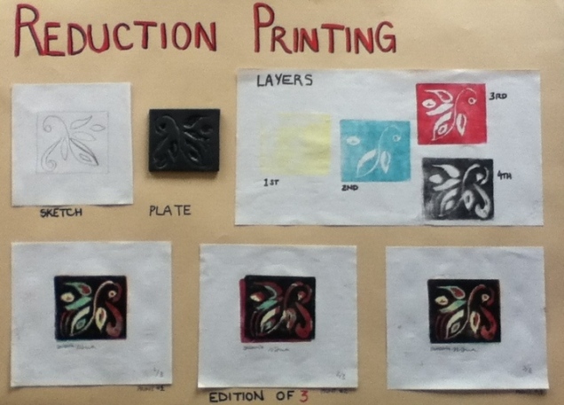
Teaching reduction printing this time, I was a bit more prepared. I now have a step by step poster to help explain the layering process. Also, in an attempt to up the quality of finished prints, I created registration jigs to help keep paper borders even while printing.
Each student created a unique design which incorporated elements of Keith Haring’s work. Using a styrofoam block, they printed an edition of 3 prints plus at least 2 additional colour variations.
All of my eighth graders finally finished their Haring inspired relief prints! We did two regular prints with black ink and then a third where we incorporated a pop of colour with tissue paper.
I introduced the artist Keith Haring to my middle school classes through new printmaking projects. We discussed the elements in his work and created our own Keith inspired prints. The sixth and seventh graders explored the process of gelli mono printing with collage and the eighth graders worked on a simpler version of the styrofoam relief prints with chine colle (*a fancy printmaking term for a technique involving tissue+glue). I felt a bit hurried to get the work finished due to class time constraints and the approaching Christmas break. Here is the first batch of mono prints, complete with creative titles. Stay tuned to see the finished relief prints!
What may be my last elementary art project… gelli print collages! I was super excited to try out my newly acquired gelli plates with elementary students this year. I collected a variety of colourful fruit and vegetables and we used analogous colour pairings of purple, red, orange, yellow and green to explore texture printing. We did a practice still life drawing first, and then I had students choose from our collective printed papers to create individual fruits. We drew outline shapes on the backside of the paper, cut them out, arranged and glued them down onto black paper. Each student did at least three different fruit shapes and had to overlap at least two of them in their composition. I also encouraged them to add stems and other details at the end. The final results: bright, colourful, and texturized compositions!
Here is yet another of my challenging project ideas where I ended up learning right along with students! I realized that the concept of reduction printing is one that is hard to explain. While I wanted them to plan out each step of the design, this is not always possible- surprises happen and often they turn out the best. I remember back to the good old days of art school and how difficult it was to figure out how all those layers of colours would interact.
So… reduction printing is when you use one surface to print and print in multiple layers. In our case, the plate was styrofoam, which is not the easiest surface to work on, but it is readily available and is a good place to start. Each time you print, part of the plate is cut away, adding detail and colour to the overall design. Keith Haring was the artist inspiration for the project. We love to listen to music and move around in art class, so I thought discussing Keith’s action packed work would get everyone excited. It was a success! We had a lively discussion about what is considered art and where it should be displayed. Haring is a good example of someone who added to that definition and that made art more accessible to the public.
The finished products of our printmaking unit are multicolour prints inspired by Haring. We used multiple colours and line to create simple figures with a message. The element of line was also used to convey movement and texture. Students created an edition of three identical prints and at least two additional colour variations.
After a week-long hiatus, I have many pictures to share! Here are some of the grade 4’s completed cartoon prints:
One of the problems I ran into with this project, is that I needed time to work with individuals. This left the majority of the class waiting at their tables and needing something to do. I wanted to give students a task still related to our current project and not just ‘busy’ work. One of my goals of this project was to have the students learn all the steps involved in making a print. So I decided to have them make a poster to show me these steps, which we had gone over several times. Many of the posters turned out really well, with creative, thought-out page layouts (although I had a hard time convincing them to add nice bright colours). This assignment was great way for them to show me their learning!
