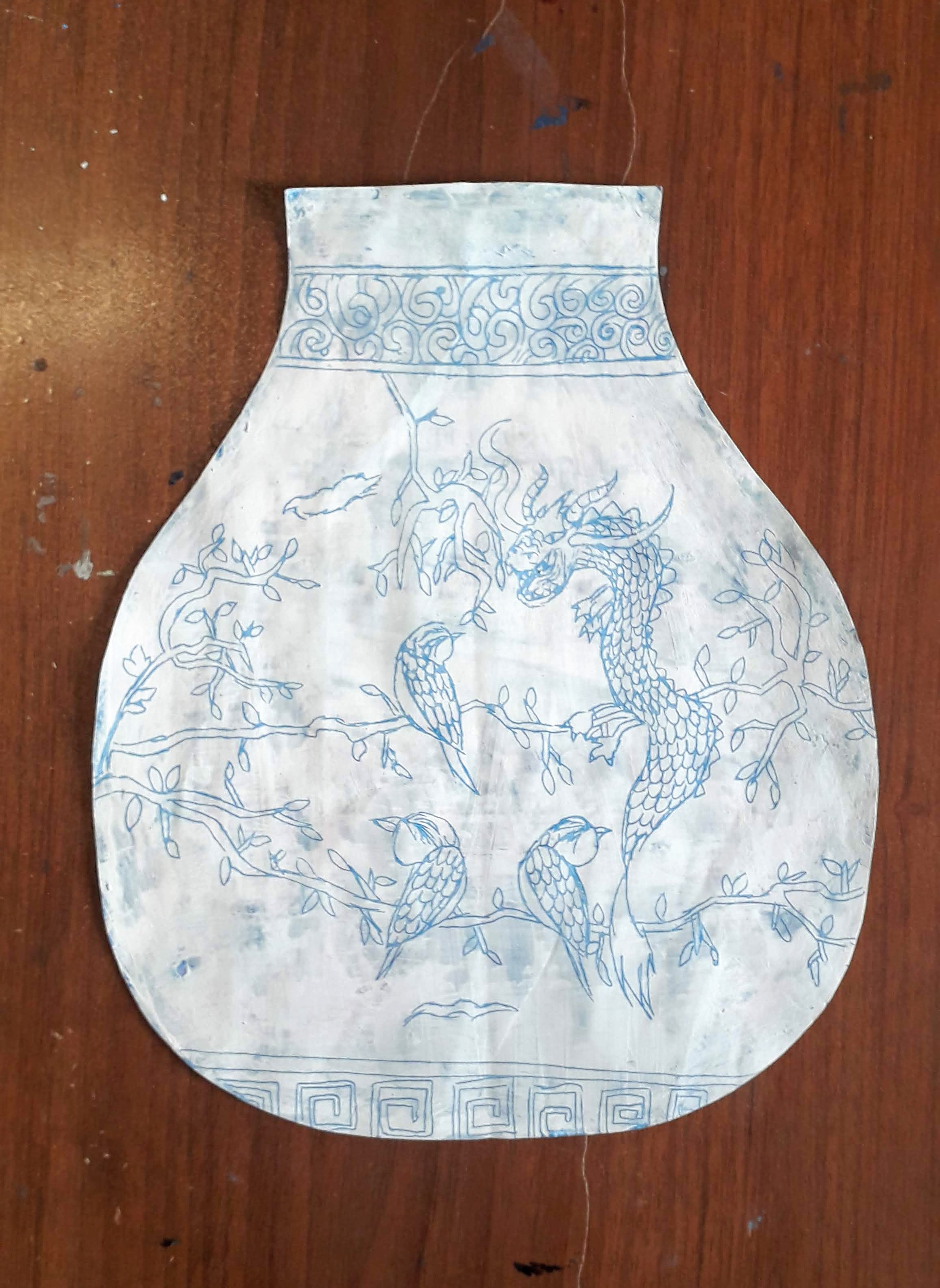
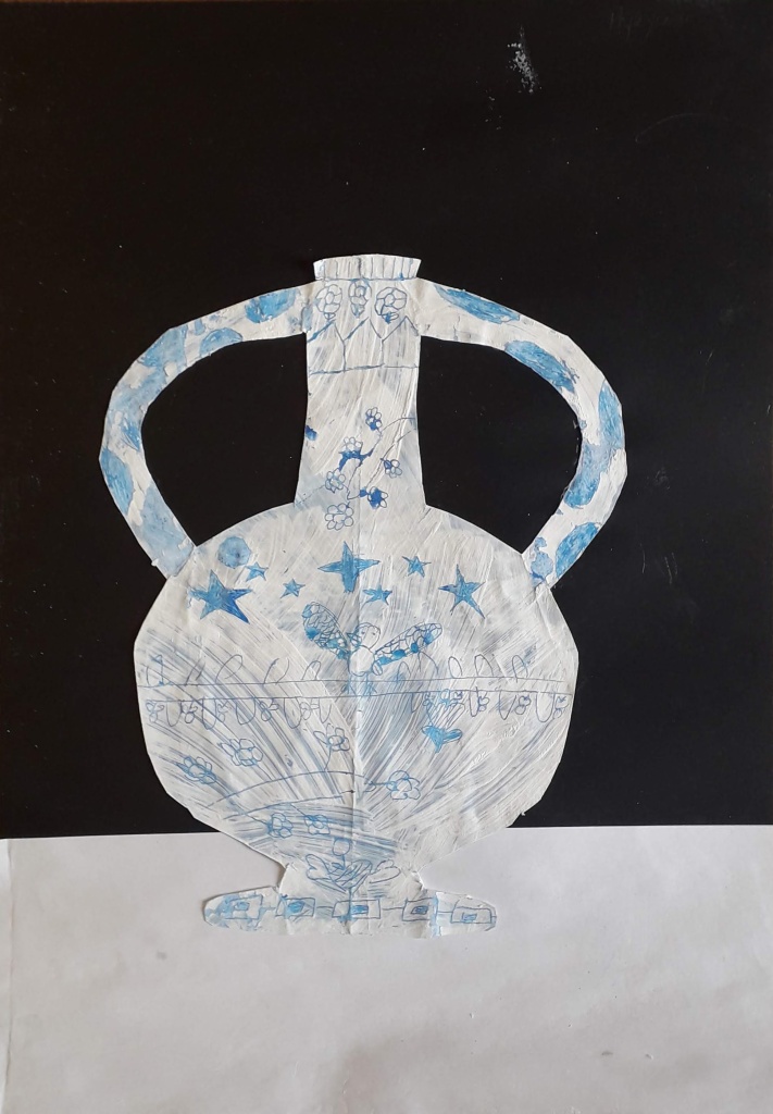
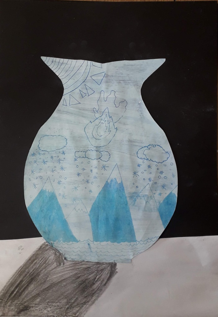
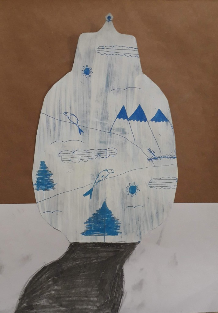
Ming Vase Designs

I am back teaching in Turkey for the semester after a long hiatus! I greatly missed this city and my students. It is a blessing to return, I feel refreshed and renewed for this next season. This semester, I am teaching elementary 3rd and 4th grade. I have not taught this group of kiddos for two years… they have grown up so much since then!

I have taught this project before, but as is true in teaching, you never teach the same thing twice! It HAS been a challenge starting out with these groups, who are split according to their language ability. One group of 3/4’s have higher, near-native English language proficiency, whereas the other, larger group of 3/4’s are English language learners (or ELLs).

Teaching ELLs in the art room has never been a huge challenge for me, as there are usually enough peer models around, and the nature of art class is very visual! Students usually do not have problems following along, even if they do not understand all of the directions for a project. I also have some background in teaching ELLs during my student teaching in Canada- I think integration of the content of art, alongside language is a perfect scenario for students to learn English!

I have found that since the two classes are grouped according to language ability, I am teaching them very differently. Keeping both groups on the same page (in terms of content) while making efforts to emphasize content language learning… this all takes a bit more thinking and additional planning!

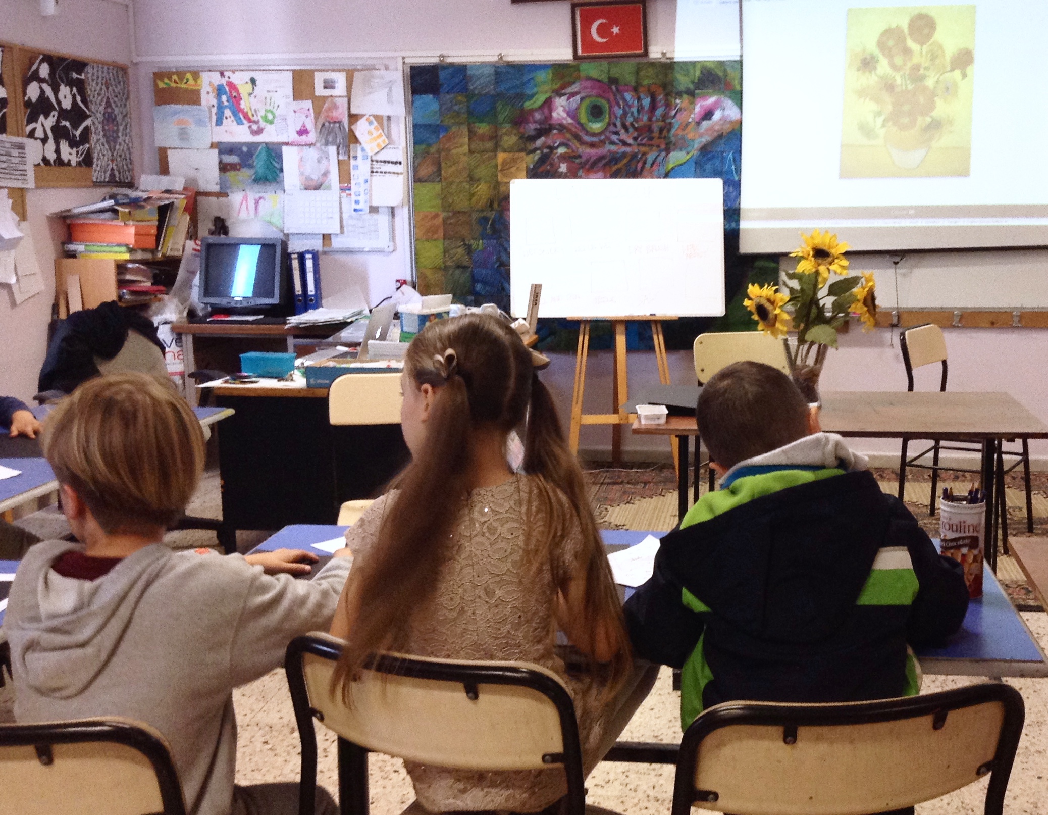
I first showed the classes a video of how porcelain Ming vases are made, from start to finish. This sequencing is important, especially as we are moving onto clay for our next project!

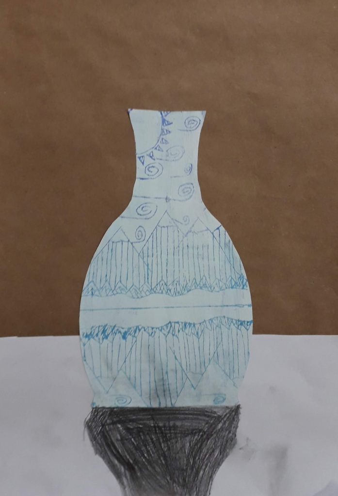
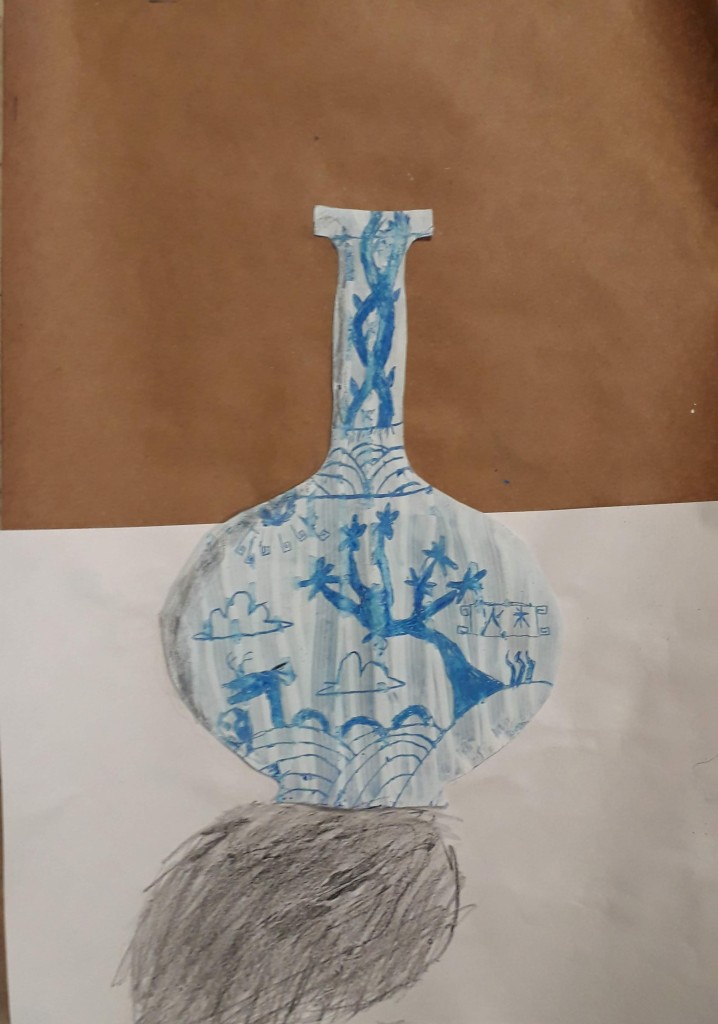
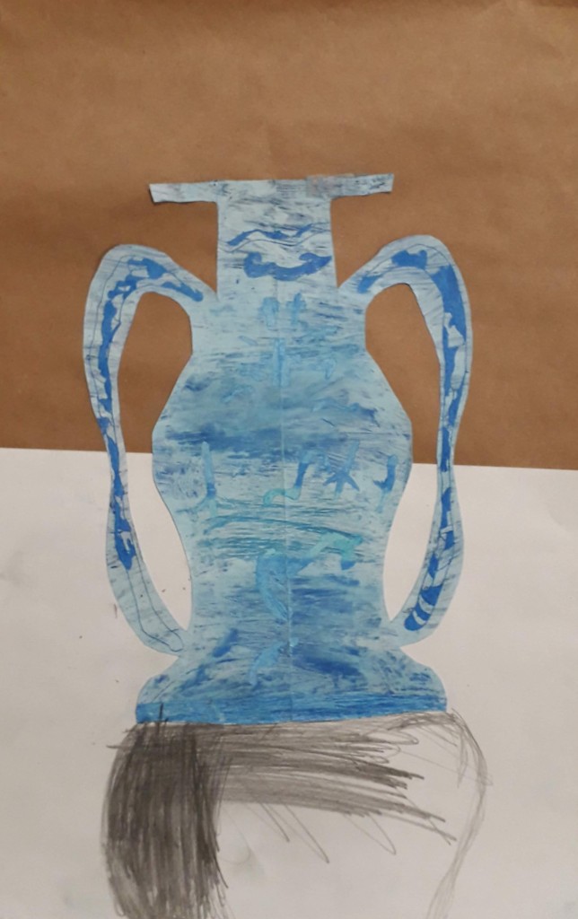
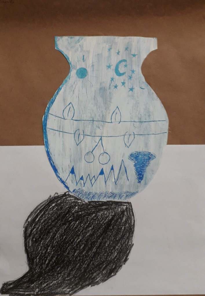
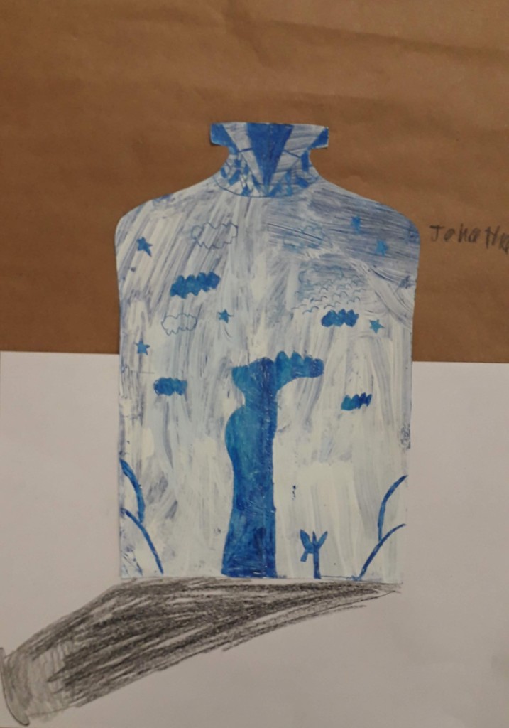
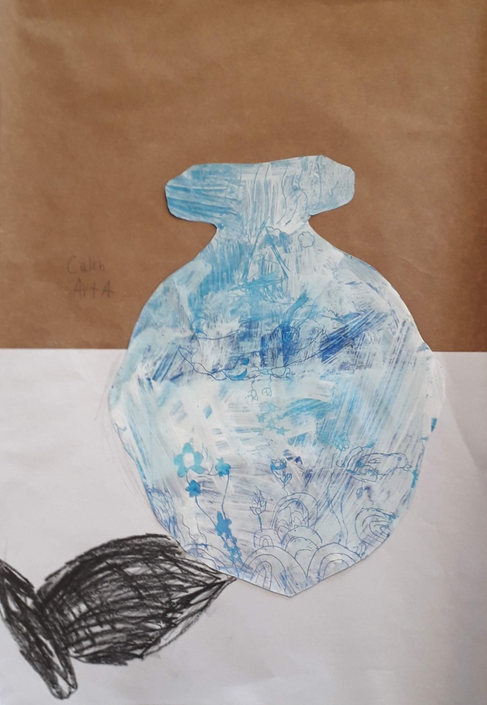
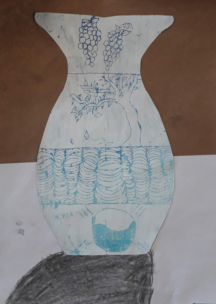
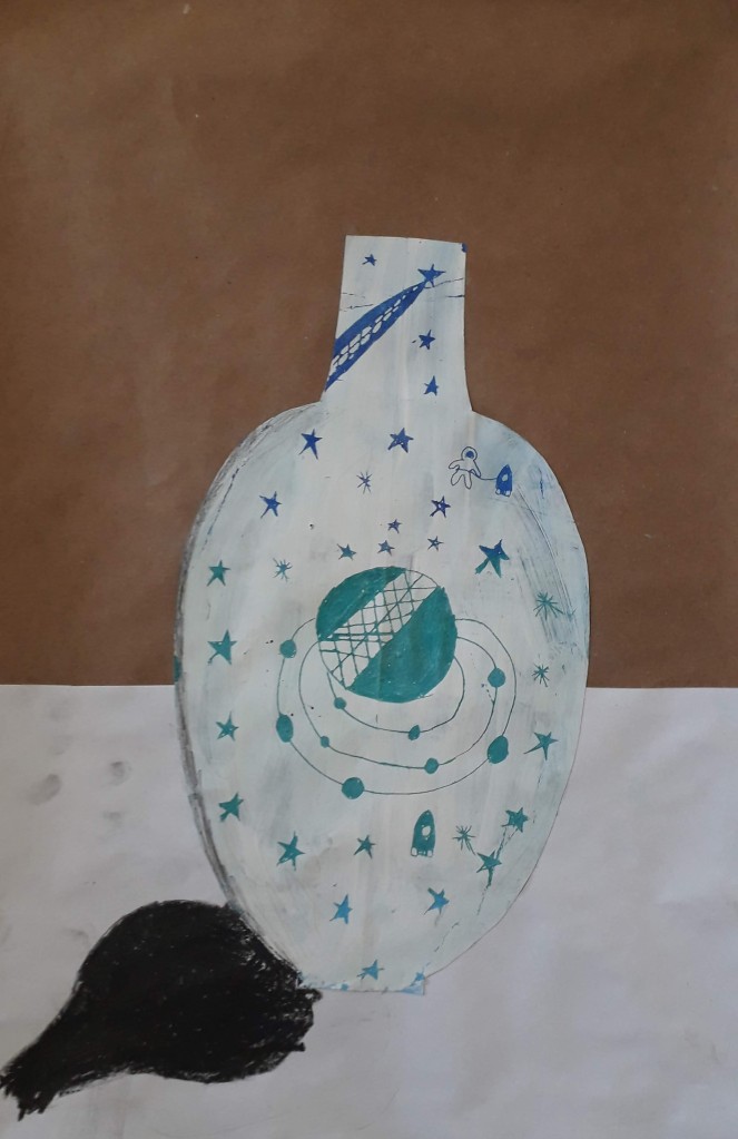
We started off with looking at different vase shapes, discussing the forms and symmetry of the different designs. I demonstrated how to create a symmetrical vase shape on A4 paper – making a hot dog fold, drawing along the edge of the fold to create an outline and cutting it out so the two sides of the vase are the same.
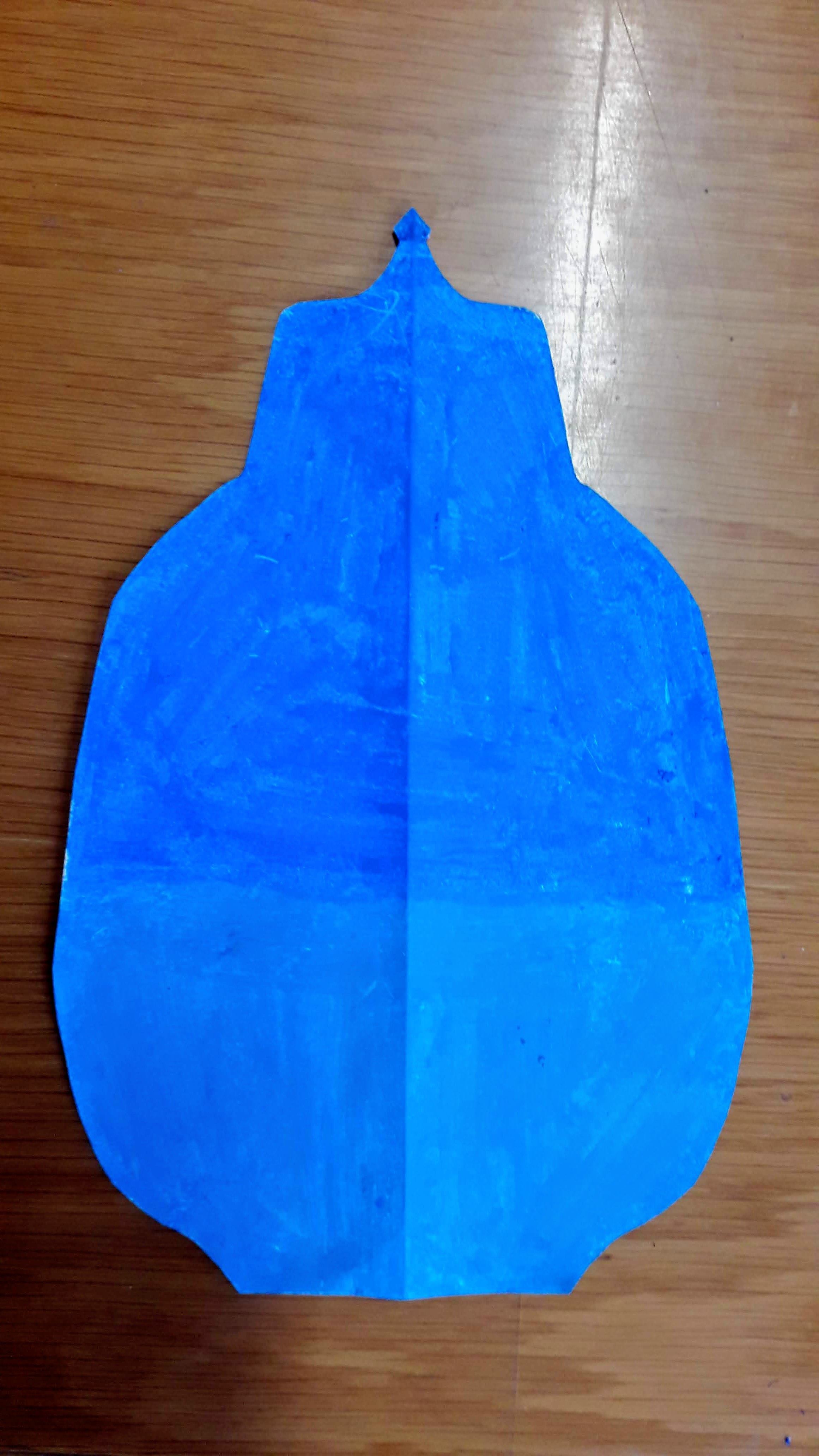
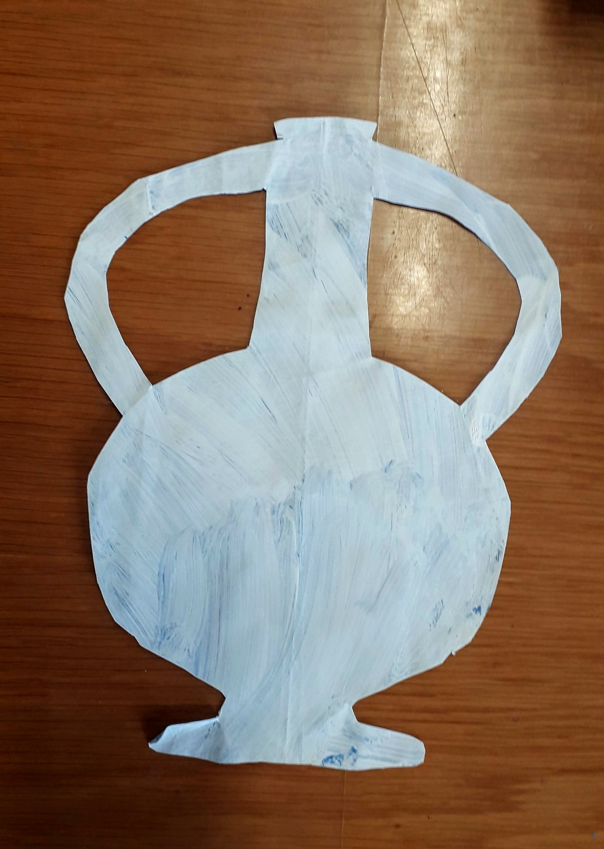
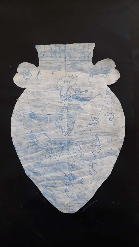
  • Step One- Fill in the silhouette shape with different values and shades of blue oil pastel
  • Step Two- Paint overtop of the blue with a layer of white tempera paint mixed with soap (this is so the paint sticks better to the oily pastel layer)
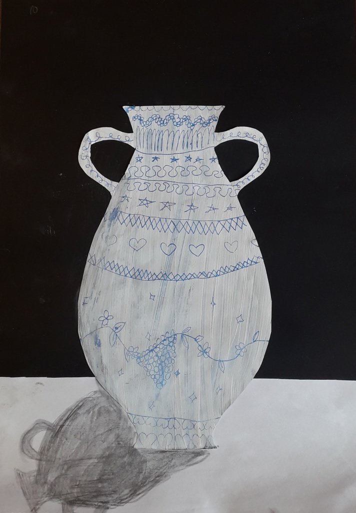
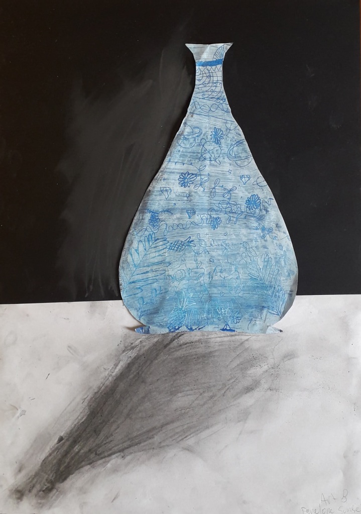
  • Step Three- Scratch a design through the layer of white paint and reveal the blue underneath

We spent some time looking at and discussing the different imagery used to decorate Ming vases. We talked about symbolism and possible big ideas that are being communicated through the work. We learned that the artisans use cobalt to draw onto the vases before they are fired, and only after coming out of the kiln do the designs turn out blue!

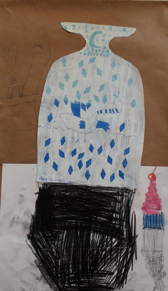
After planning in their sketchbooks, students began scratching their designs onto their vases. Finished designs were mounted onto black or brown paper. Another challenge I am facing now more than ever, is having students all on very different steps of a project. Early finishers had the opportunity to add a table surface and an indication of light and shadows on their vases. They drew in the shadows using graphite. I did not give them very much instruction on this, it was insightful to see how they all interpreted this differently on their own!
4 Years of AP Art!

I am in a very reflective mood. This year, I taught my fourth group of AP artists. It is SO good for me as an educator to see how far I have come in my abilities to teach and mentor students at this level. I could not be more proud of these girls and the hard work they put in for the scores they received.

Throughout this year (and second semester in particular), I aimed to make the class really special, and to cultivate a collaborative learning environment beneficial for both me and my students. I knew this might be my last time teaching the class for a while!

I thought I would share a few of my favourite projects over the years- the AP art program is going through some big changes this next year, so I may not have the chance to use these again!

Collections

This week with first grade was a delight.

They came into the art room to a frantic, confused teacher who was just not ready. For some reason I did not realize which class came first that day- I had prepped for the WRONG class! Honestly, I told them that Miss Twa was “just not ready”. It was one of those days.

I decided to teach the lesson I had already prepared to the class anyway. These kids blew me away with their attention to detail and observations.

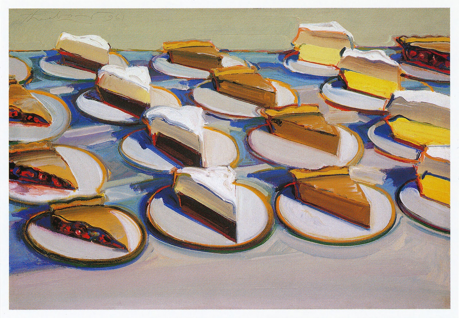
thiebaud-pies
Wayne Thiebaud Pies, Pies, Pies (1961)


We looked at Wayne Thiebaud’s picture and talked about how he arranged his collection of cakes. We talked about the objects that we collect- shells, rocks, coins, stamps…

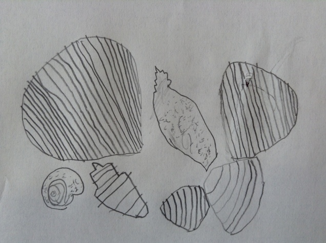
Each student had a collection of objects at the table from which they had to draw. After arranging the items, we discussed looking carefully to draw what we see. The results are awesome!

Another lesson to add to my collection, today marks three years of being here in Turkey!


Van Gogh: Colour, Cut and Paste

Here are second grader’s versions of Vincent van Gogh’s Sunflowers. We first did a practice observational drawing. Then the students each drew their own vase and coloured it with three colours of chalk pastels. Next, they painted a paper with the colours and textures they observed in the sunflowers- a large area of yellows and smaller areas of oranges and browns. Once sprayed with fixative, the vases were stuck down onto black backgrounds. Then the task of assembling each flower began. Stems and leaves were added at the end using scraps of green paper and each signed their name on the vase (just like Vincent!)

Design-a-Chair

Several of this year’s eighth grade projects have involved drawing and illustration of some kind. I think both the students and I were ready for a change! I thought a problem based design challenge would be neat to try, giving them an opportunity to be creative and use their hands to build with new materials.

I allowed them to create their own project brief. Each student had to identify a specific consumer with a problem. We sketched initial ideas and made a list of possible materials before trying our hand at building a model.

Most of the students were fairly engaged throughout the building process. There was some trial and error. I did give suggestions for those that needed them, but for the most part they experimented on their own. I also had them write a reflection at the end, on their process of creating the finished piece.

The last step was my attempt to introduce a communication design component. We looked at examples of product advertising and discussed the target markets and how each was drawing attention. Each student did a thumbnail sketch first to plan out their design, which needed to include an observational drawing of their model in colour, and text to communicate a message/sell the product.

This slideshow requires JavaScript.

In introducing the project, I had referenced the Shark Tank and explained how each inventor pitches their idea to a group of investors. For our final class, we presented our finished posters and designs to the group. Each design was scored by a panel of peer reviewers and could get a certain number of points in each of three categories: Creativity, Craftsmanship and Presentation. The students also gave each other positive and constructive feedback-an important part of the artistic process! At the end of class, we voted on a top scoring design for each category and one overall design.

Van Gogh Sunflowers

I love springtime- the fresh air smells, the increased daylight, the sunshine and weather that is warming up. Springtime also conjures up many memories of seasons past- it is a time of year when many of us need a bit of cheering up. At school there remains the busyness of final quarter assignments and looming exams. The art room is in a constant flurry of activity and creative messes- students are coming in and out throughout the day and piles of artwork are everywhere!

Sunflowers are bright and cheery- they remind me of my grandmother, she loved them. Vincent van Gogh’s Sunflowers is the inspiration for this year’s elementary still lifes. As a class we looked at his paintings and discussed the colours he used- a lot of yellows! I asked the students whether this made the painting look happy. A few observant little ones noticed not all of the flowers were alive, some of them droop and have withered, brown petals.IMG_4077

In first grade, we did sunflower drawings inspired by van Gogh’s and looking at our own still life vase of sunflowers. We added the colours and textures we observed using oil pastels.

IMG_4317In kindergarten, we made a collaborative sunflower painting. The students each cut their own flower shape from a coffee filter and added the different textures and colours they observed from the still life set up. Some of their colour choices were lovely! I then had them paint the background and vase, copying the colours they saw in van Gogh’s painting. Then they each stuck down their flower to fill the vase and added green stems and leaves. This one looks so great hanging up in the hallway!


White on Black Drawings

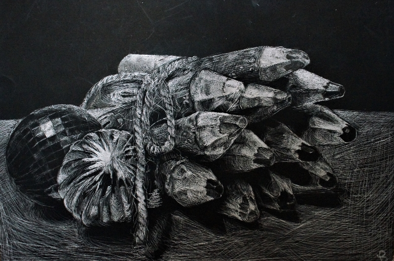
I wanted to introduce my eighth graders to scratchboard- paper coated with white clay and sprayed with a layer of india ink. Before starting on scratchboard, it was important to have them practice drawing objects and areas of light on a dark background. This way of drawing white on black works opposite of the way we draw with pencil on paper. Instead of drawing a visible outline of an object, I wanted them to fill in areas with the values they saw. I set up still life arrangements of white, geometric objects, and gave them white coloured pencils and black paper. We discussed different techniques we could use to show the varieties of white present, including varying the amounts of pressure, types of mark making and the proximity of the lines. These are what they came up with.


Candy Compositions a la Wayne Thiebaud

Whew, it has been a while… a lot has been going on in life and at school. We are almost at the end of the year and busy finishing projects! I wanted to try a project like this for a while after seeing many pop art inspired projects on blogs I follow. This ended up being another long, multi step project- but this time with the incentive of candy for finishing.  It was a good way to review what students knew about colour and value, and to continue practicing observational drawing skills. Introducing the grid to help enlarge compositions was a new concept for many.

This slideshow requires JavaScript.


Gelli Print Collages

What may be my last elementary art project… gelli print collages! I was super excited to try out my newly acquired gelli plates with elementary students this year. I collected a variety of colourful fruit and vegetables and we used analogous colour pairings of purple, red, orange, yellow and green to explore texture printing. We did a practice still life drawing first, and then I had students choose from our collective printed papers to create individual fruits. We drew outline shapes on the backside of the paper, cut them out, arranged and glued them down onto black paper. Each student did at least three different fruit shapes and had to overlap at least two of them in their composition. I also encouraged them to add stems and other details at the end. The final results: bright, colourful, and texturized compositions!

This slideshow requires JavaScript.