As we move into a new normal of teaching remotely, I have been inspired by all of the resources out there and the many art teachers sharing their great lesson ideas! In planning projects, I want to account for kids with little to no resources at home, and think of what they could use to make art, perhaps in a different way than we do in the classroom. With so many creative ideas circulating, I decided each week to give students three choices in how they could create, with differing levels of difficulty, thought and creativity involved. I had so much fun creating my example, I thought they would too!
I was surprised at the number of responses and how many of my students turned in work. I was also happy to receive at least one student example for each of the prompts I provided.
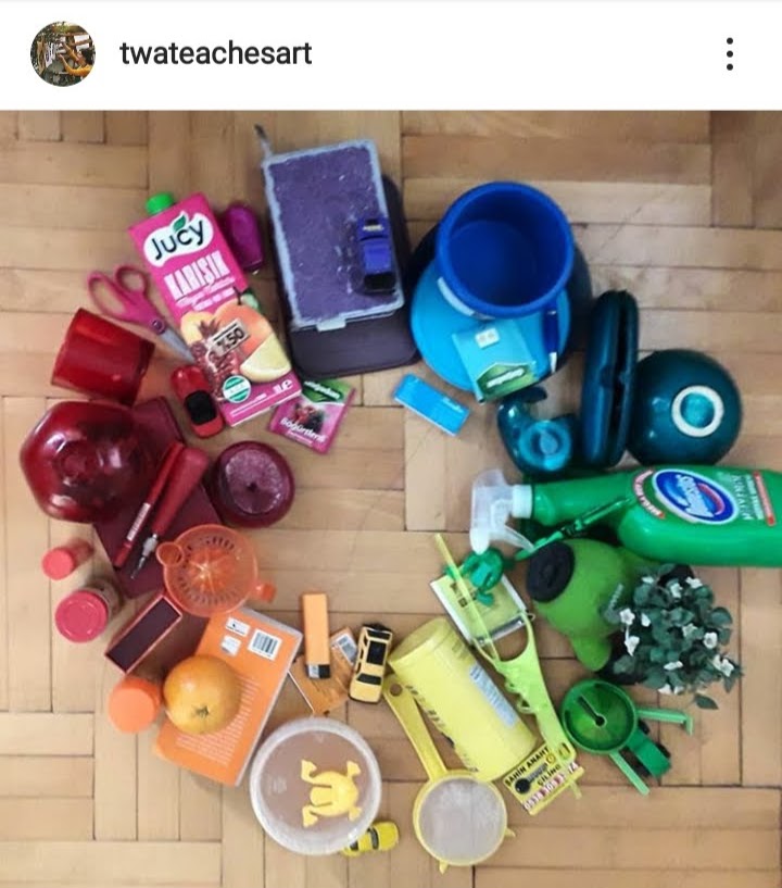
Follow me on Instagram @twateachesart
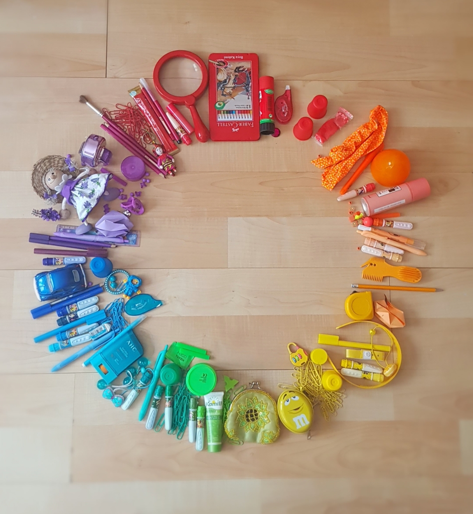
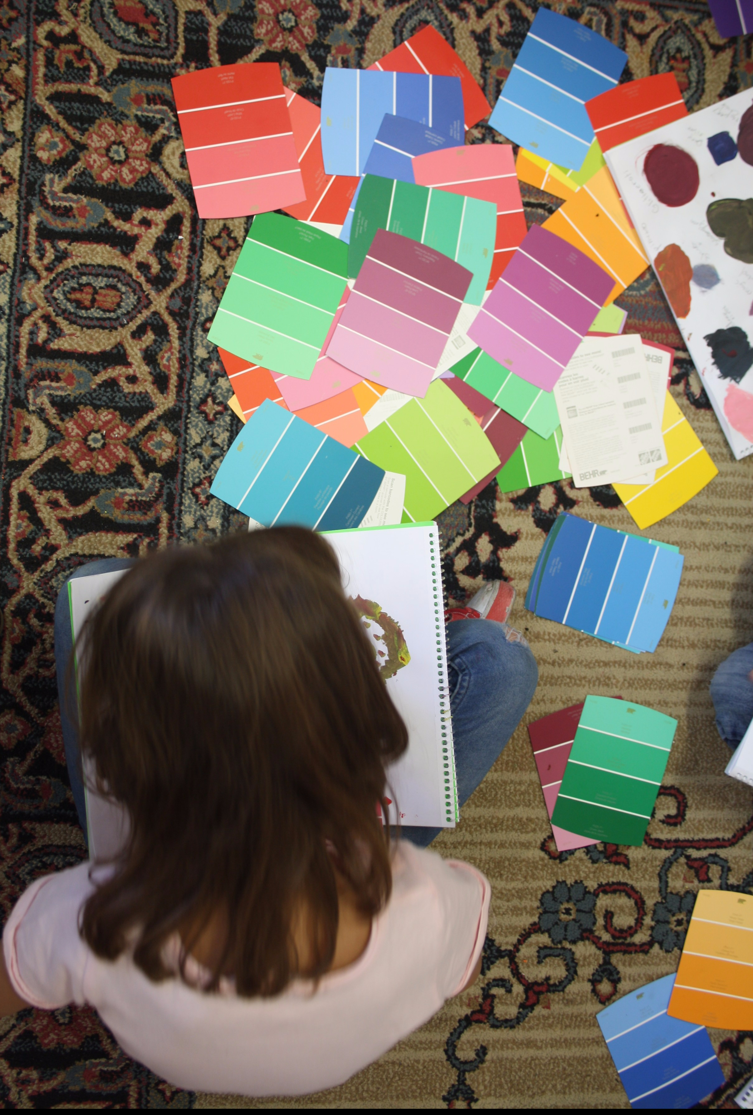
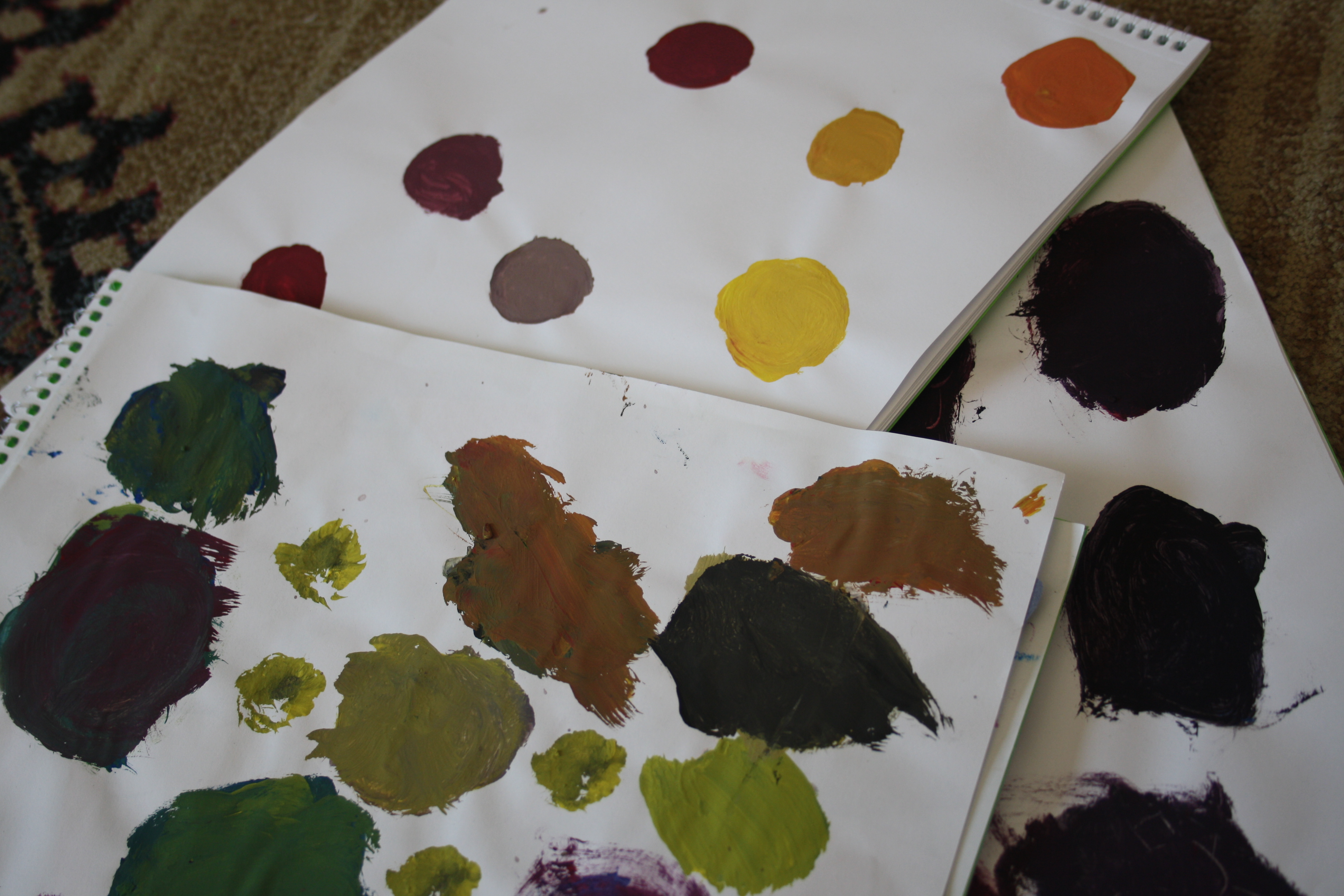
Found Object Colour Wheel 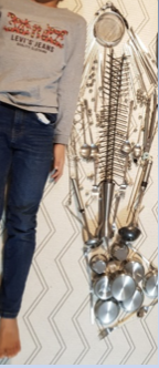
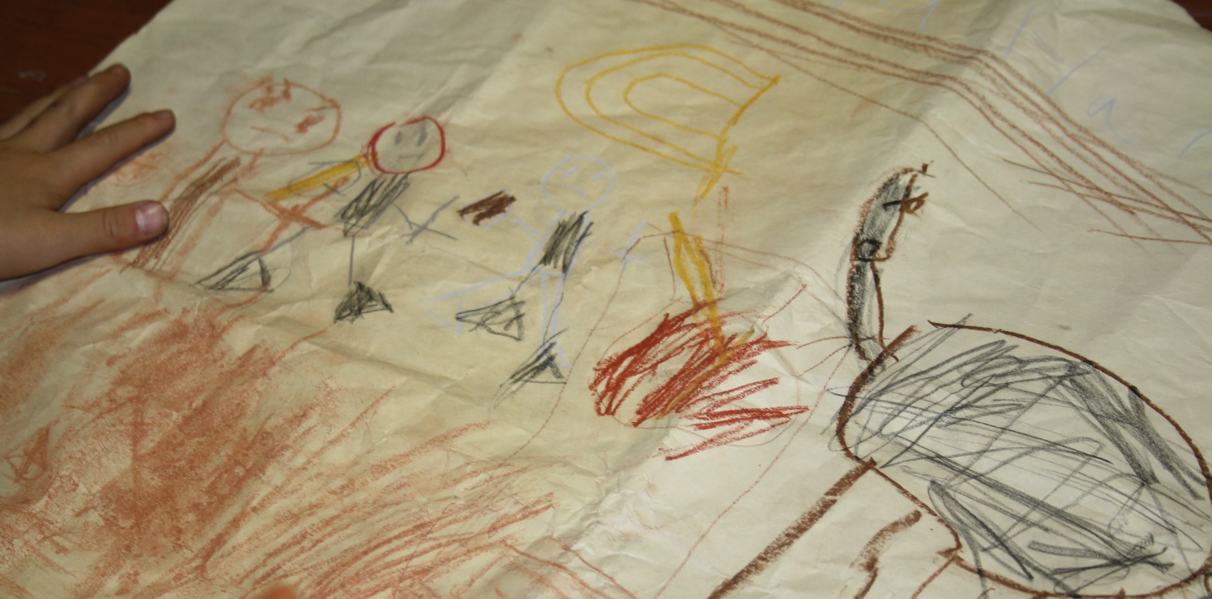
Andy Goldsworthy Inspired 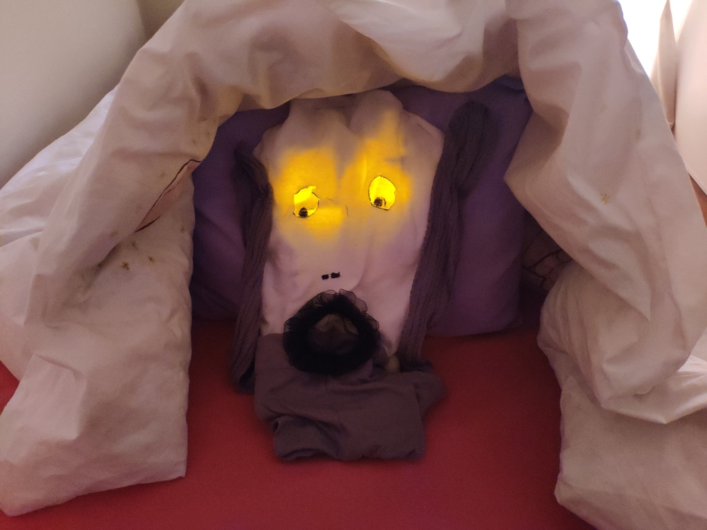
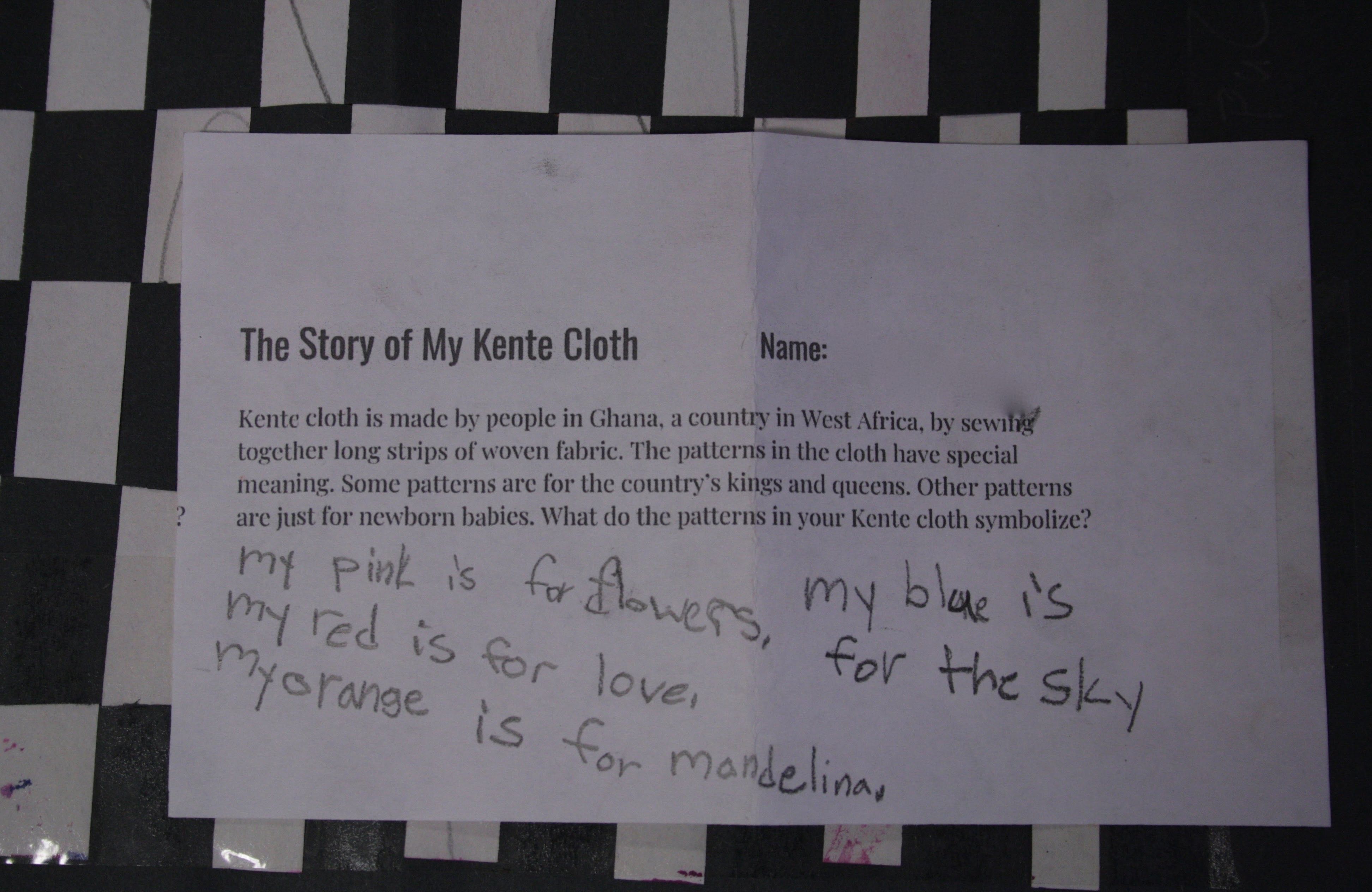
Re-creation of a Famous Artwork
If you want to try the project for yourself, see this link for instructions… and send me a photo of your finished product!