Beginnings

We are already into the fourth week of school and the busyness does not slow down! Hard to believe that on this day five years ago, I moved to Istanbul. What a wild adventure it has been!

I wanted to share some of the middle school projects from our first weeks. It has been two whole years since I taught middle school, so it will take some getting used to again. I am glad I keep a blog because I have a record to look back on of all the wonderful projects from years past.

20180907_161359
The fifth and sixth graders About Me sculptures

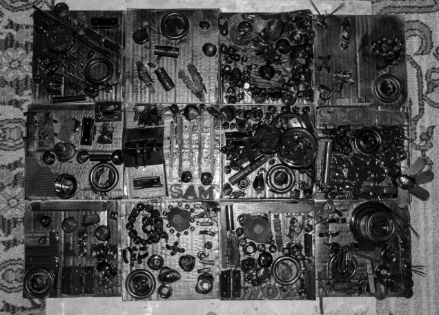
We started off the year with making portfolios- I will have to remember to share some photos!

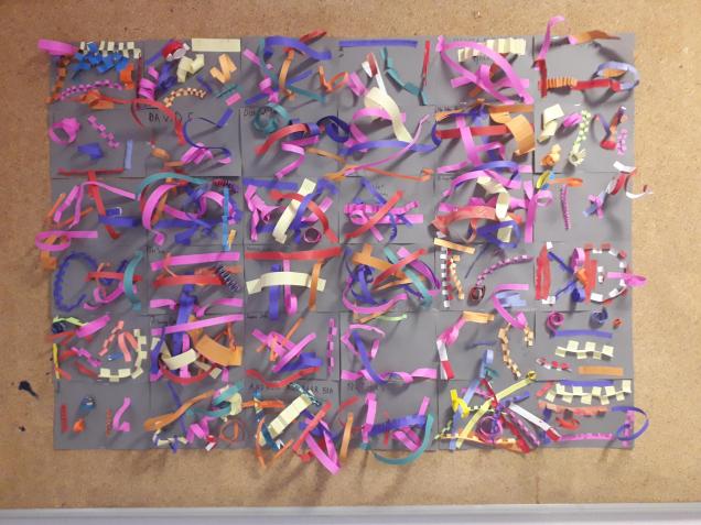
The new middle schoolers, the fifth and sixth graders made paper line sculptures. These are hanging up in the hallway across from the art room. Each line represents something about the artist; for example, an orange tab if you have been on a train, or a green spiral if you like ayran (a Turkish yogurt drink).

This project may look familiar, it is typically one that I do with kindergarten (see here and here) but I have learned that it works for many ages. Thank you to Cassie Stephens once again for the inspiration!

Fifth through eighth graders also made paper foldables for the elements of art; this was information I knew I wanted them to get down from the beginning!

Here are a few of the finished foldables. Each of the seven elements of art were to be written in an illustrative way; to add meaning to the element. Inside are definitions for each element and further drawn examples.

This slideshow requires JavaScript.


Peruvian Arpilleras

I am so excited about this year’s final elementary pieces! I will be handing over the reins of elementary art to a new teacher next year, so these last moments with the students are precious.

We began this project looking at calendar images; describing the different parts of a landscape, including colours and textures. I had a few volunteers come up to the board to draw lines to show these different textures. Then we got busy painting (and stamping) paper to represent water, rocks, grass, flower fields…

A few lessons were spent painting paper before we had enough, I think we all enjoyed the process. Then we talked about assembling our landscapes in layers on a background paper. We talked about the different colours the sky could be (I ran out of the usual blue paper!) and what we could put in the foreground, middle ground and background. The students cut paper for each of these parts and glued down the pieces. I encouraged them to include additional shapes with paper- trees, rocks, clouds, sun…

A following lesson, we learned how to fold an origami house using two sizes of paper. To create a sense of perspective, we made larger houses to put in the foreground, and smaller ones for further back. We used pieces of foam behind to pop out these houses even more!

Once we had all of our main shapes, we added details. Out came the puffy paint (never thought I would go near this stuff, it has taken 5 years!) We practiced first on scrap paper, making dots, dashes, wavy and zigzag lines before moving onto embellish our landscapes.

The final step to make these arpilleras more textile-like: I had the students punch holes along two of the sides (some chose to go all the way around) and I demonstrated how to ‘sew’/wrap the edges in yarn to finish it off.

They are oh so lovely and colourful, and we learned many lessons along the way


This slideshow requires JavaScript.

Credit for this idea goes to the amazing Cassie Stephens


Relief Assemblages


This was our final project in fifth grade, following bootcamps in the art elements and principles. We looked at Louise Nevelson’s work, trying to identify recognizable objects and discussed the idea of relief and assemblage (sculptures utilizing found objects). I gave each student a square of cardboard, asking them to fill it with an assortment of forms. This was a great way to get rid of those little bits I have been storing: popsicle sticks, bottle caps, pasta, shells etc. I asked them to make sure they filled the whole space, and had areas of both high and shallow relief.

The final step was to spray paint the pieces, unifying all the components together. I was able to get extra time to take the class outside so each student could paint their own piece. It was a lot more fun to have them involved than for me to do it myself. A few of the students said they felt so ‘cool’ spray painting, it makes me want to do a graffiti unit with them next!

This slideshow requires JavaScript.

I photographed each piece as it was drying outside. The paper backdrop with the paint remnants and shadows created an additional element of interest!

IMG_4717
The finished class arrangement of tiles

Bootcamp: Shape, Space and Form

This week, we reviewed line and texture and learned about the element of shape. We looked for examples of shape in artwork and discussed the differences between geometric and organic, positive and negative shapes. Students then worked on a collage that incorporated both coloured and textured shapes. Finally, we explored how a flat shape can become a form if it is “popped”, bent, rolled, twisted, folded and attached to a surface. First and second created their own abstract paper sculptures with form and texture, while the older students created one form to add to a collaborative sculpture.

Fifth graders used their previous work as examples for each definition.

The Printmakers Strike Again!

I finally have finished products from our printmaking unit. This is the second time I have done these projects and the results are even better (see last semester’s prints here and here)! I think it is time for new artists, I feel I have exhausted Keith Haring! This group is a bit bigger than my last class, so it took some organization to make our way through everything.

I love gelli printing. I love watching the kids explore the endless possibilities of texture and colour to create unique one of a kind prints. I especially love when the paintbrushes come out- when the real experimenting begins and unexpected surprises happen! These printing sessions were going on at the same time we were working on our artist pages. The inspiration for our prints was a variety of tools, similarly to Jim Dine. We discussed how we could add emphasis to create focal point(s) in each print- whether this be through line, colour, value, space, or texture.

Project #1 Monotype Prints with Emphasis

This slideshow requires JavaScript.

Project #2 Keith Haring Reduction Prints

Teaching reduction printing this time, I was a bit more prepared. I now have a step by step poster to help explain the layering process. Also, in an attempt to up the quality of finished prints, I created registration jigs to help keep paper borders even while printing.

reduct

Each student created a unique design which incorporated elements of Keith Haring’s work. Using a styrofoam block, they printed an edition of 3 prints plus at least 2 additional colour variations.

This slideshow requires JavaScript.