I am in a very reflective mood. This year, I taught my fourth group of AP artists. It is SO good for me as an educator to see how far I have come in my abilities to teach and mentor students at this level. I could not be more proud of these girls and the hard work they put in for the scores they received.
Throughout this year (and second semester in particular), I aimed to make the class really special, and to cultivate a collaborative learning environment beneficial for both me and my students. I knew this might be my last time teaching the class for a while!
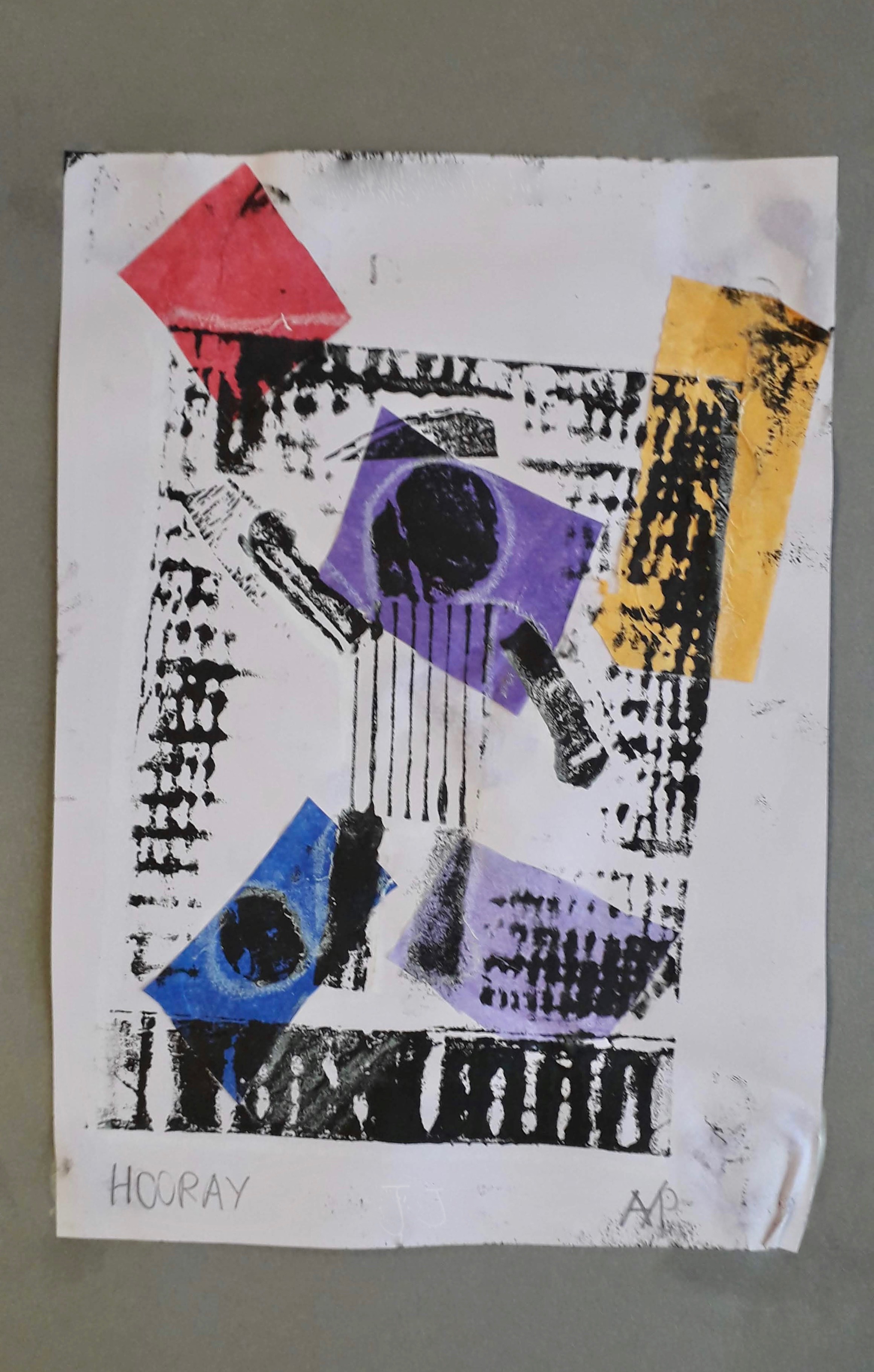
I thought I would share a few of my favourite projects over the years- the AP art program is going through some big changes this next year, so I may not have the chance to use these again!

3 Tone Still Life: Metal & Eggs 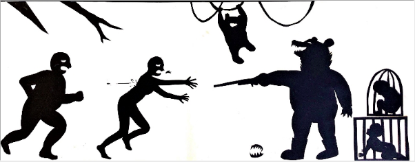
Kara Walker inspired Illustration of a Social Issue 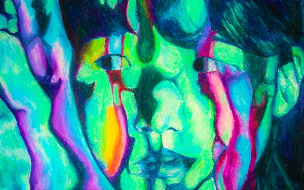
Projection Self Portrait 
Geometric Value Study 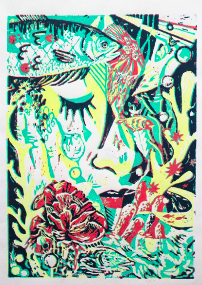
Multicoloured Reduction Lino Print 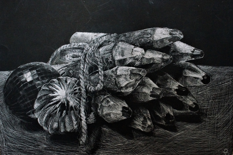
Scratchboard