Careers in Art

The last three weeks of school, we explored different careers in the arts and students again had a choice of projects:

Interior Designer

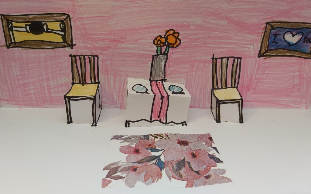
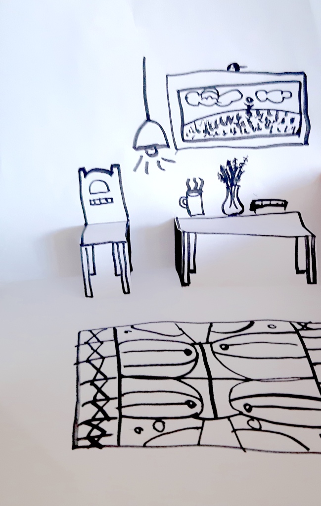
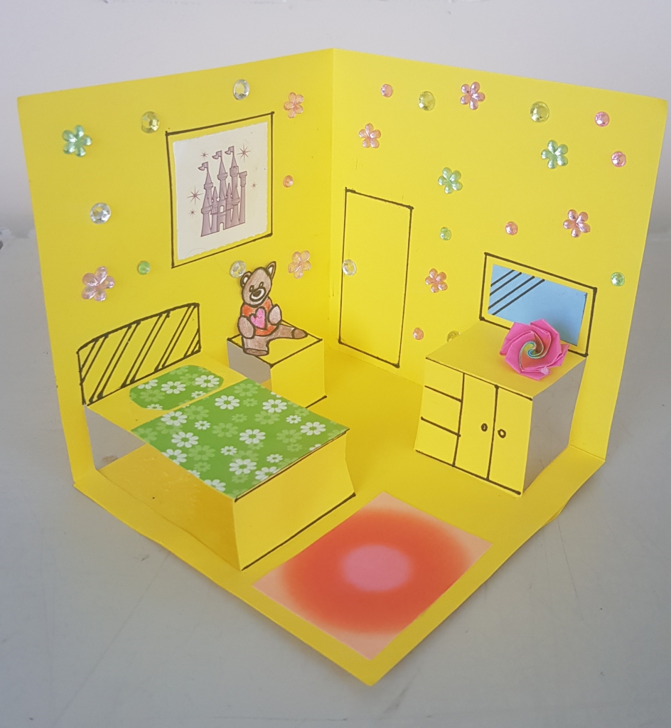
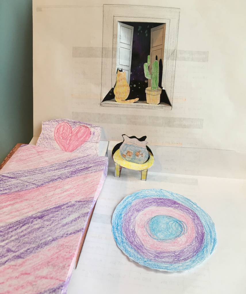
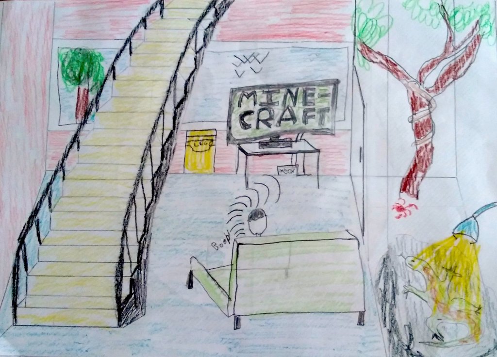
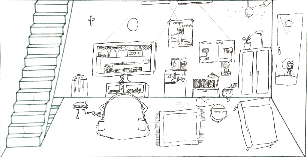
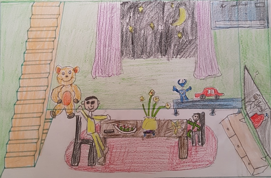
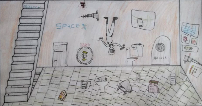
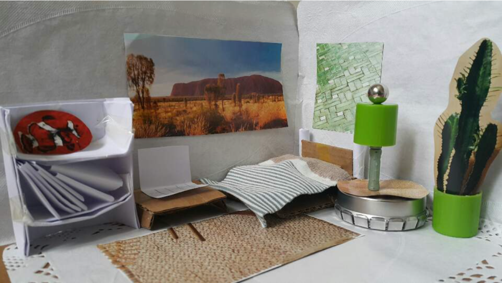
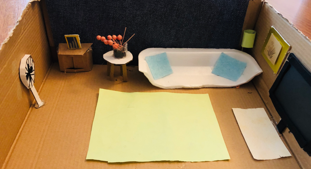
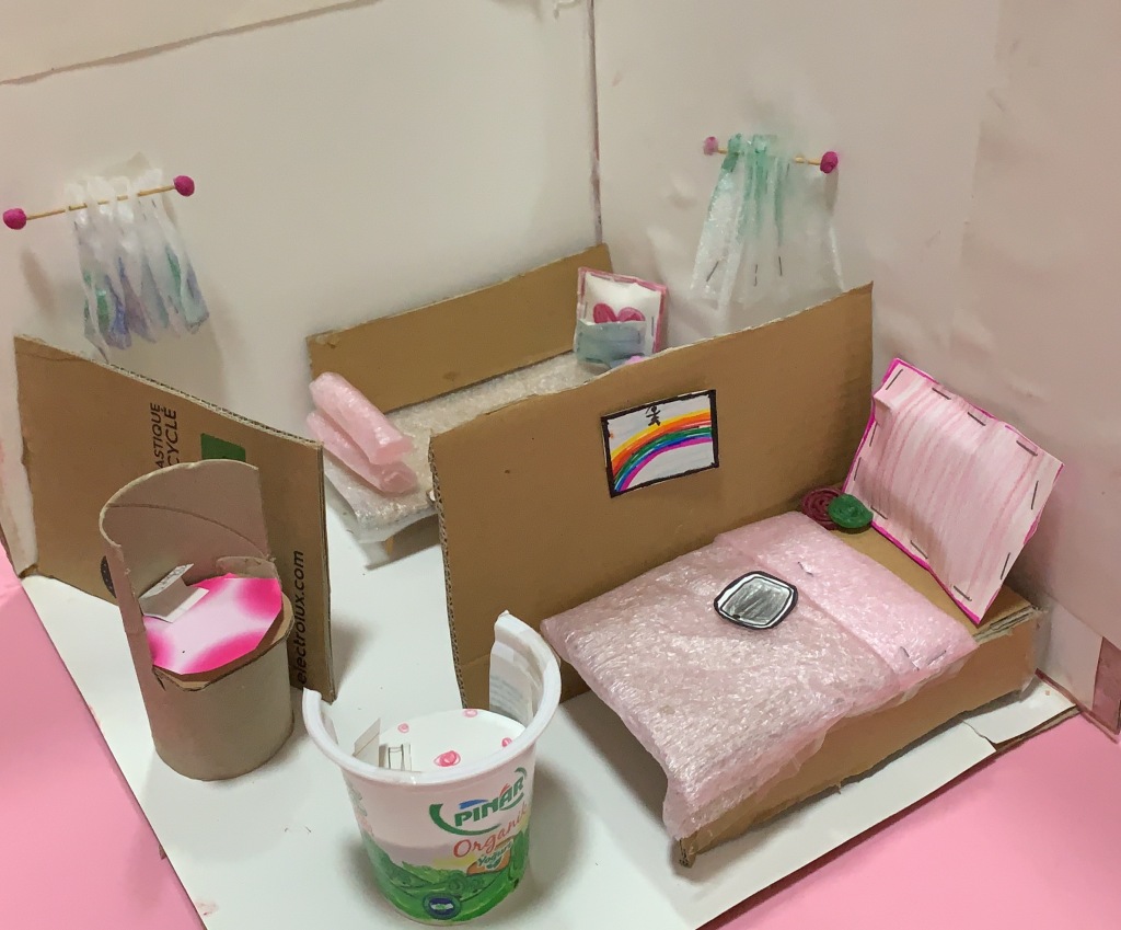
For the first week, we explored Interior Design. Students had the choice to 1) create a pop up room design drawing, 2) create a drawing of their ideal quarantine space (part of a worldwide collaborative drawing project) or 3) create a 3D miniature model. You can see further project details here.

Graphic Designer

Quaranzine

Fashion Designer

Photographer

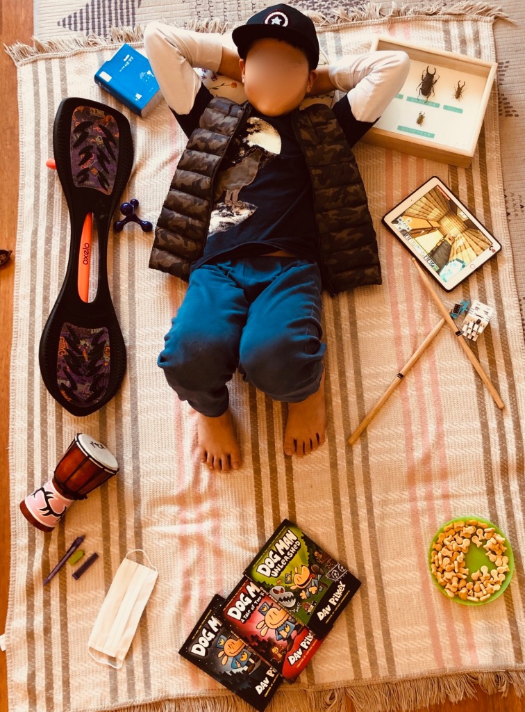
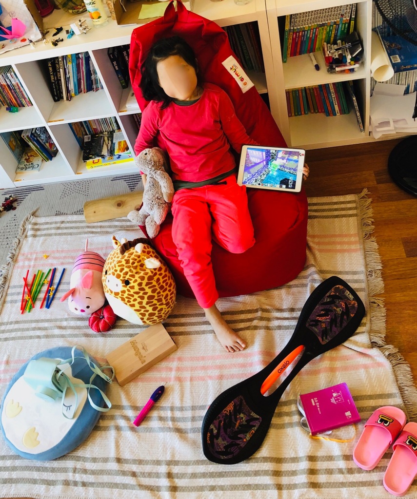
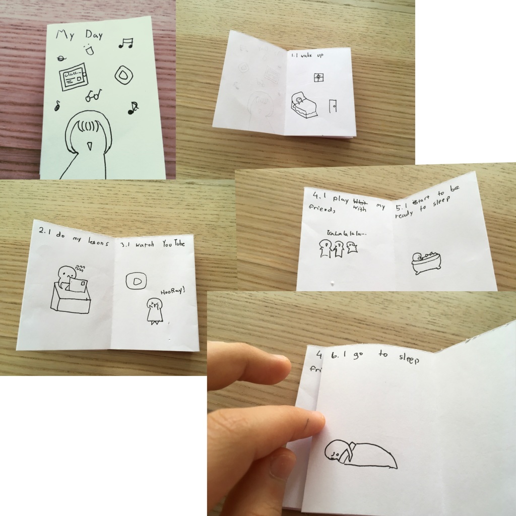
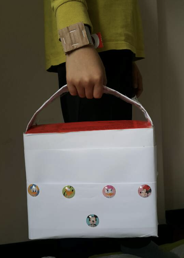
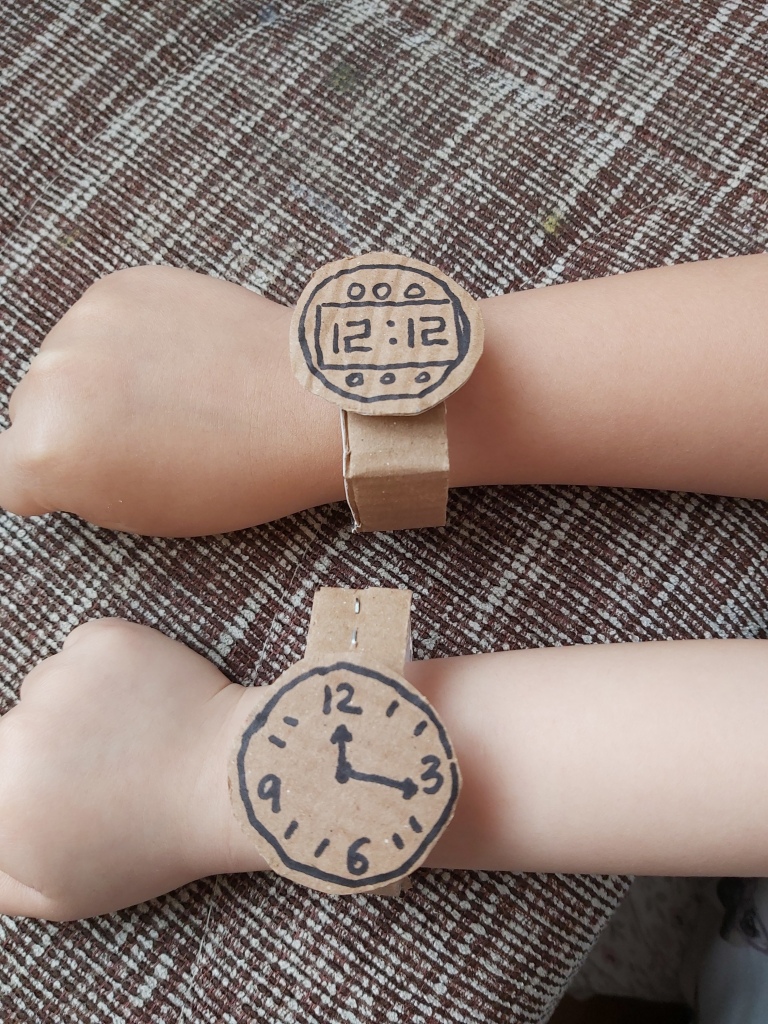
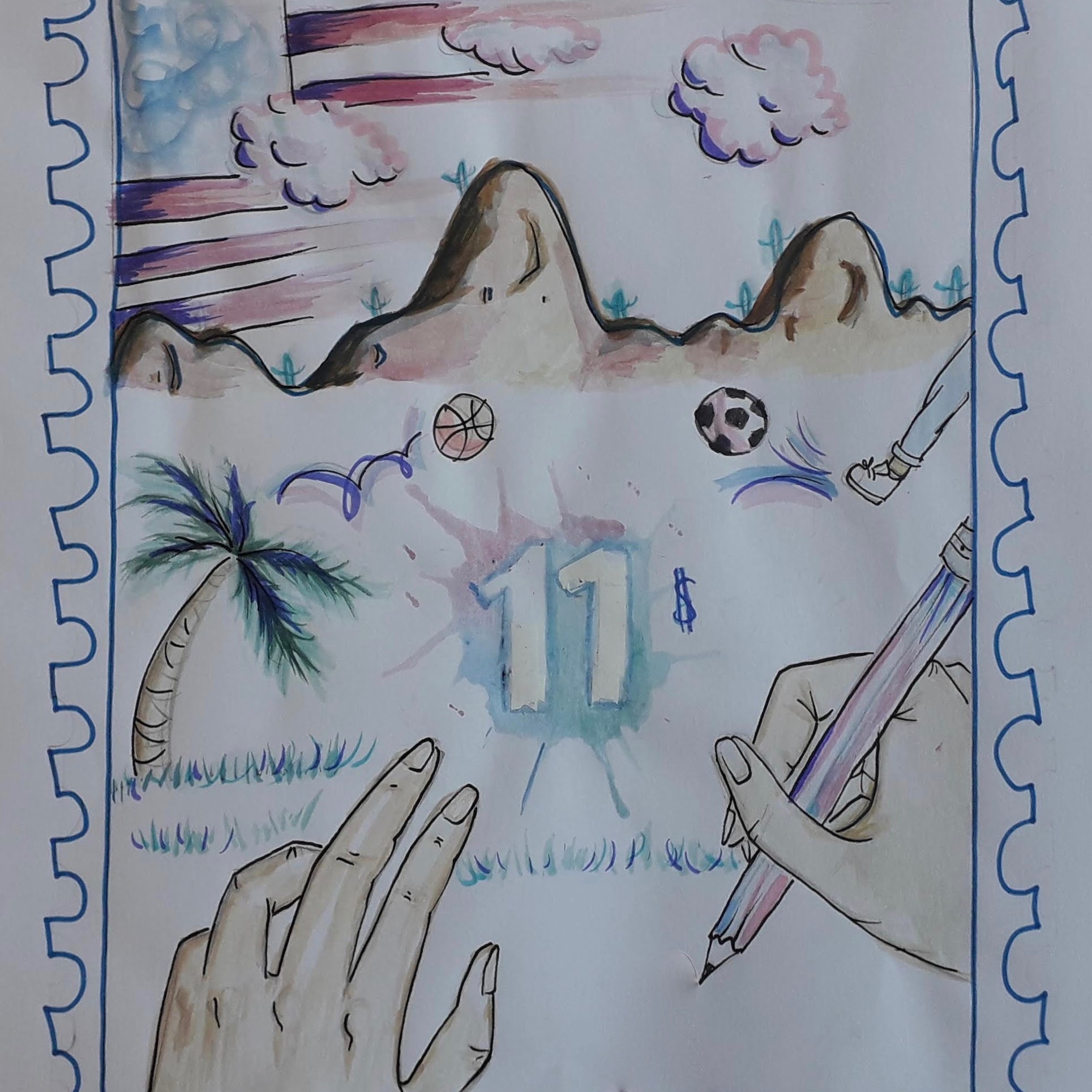
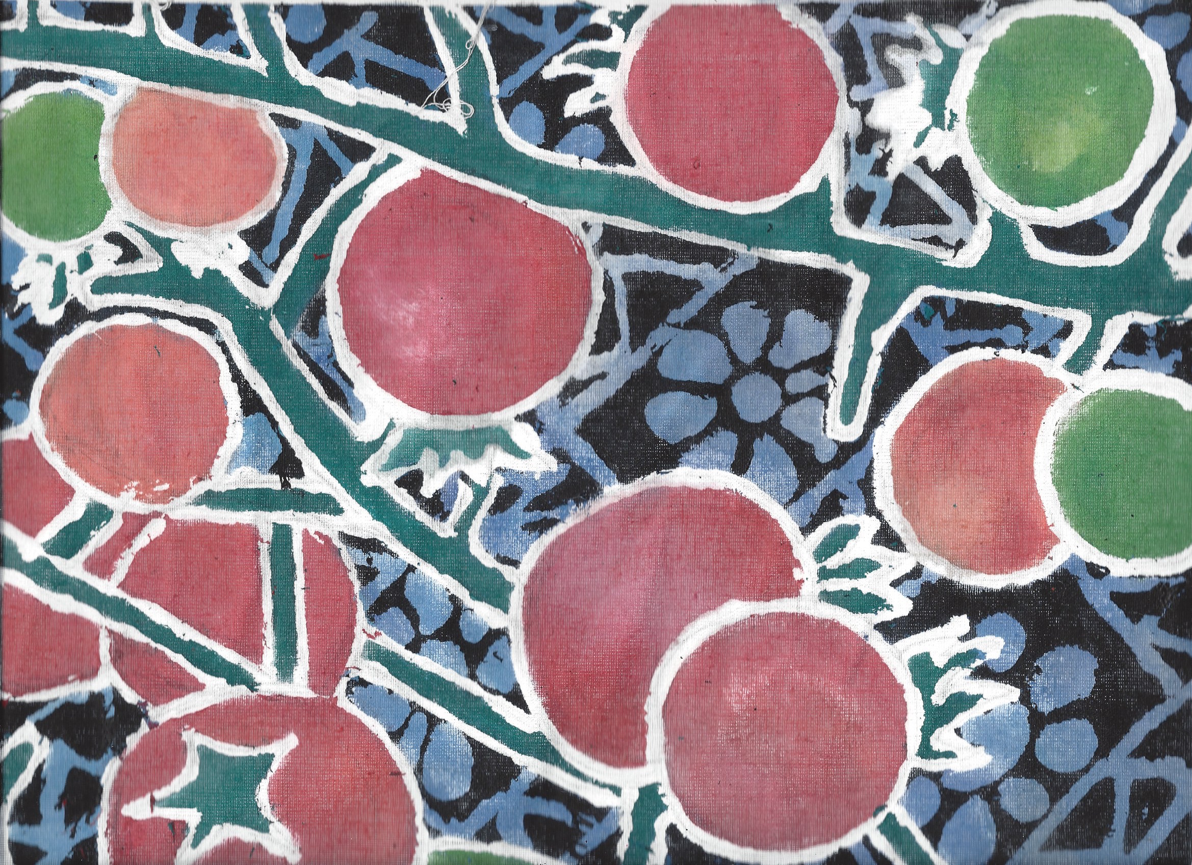
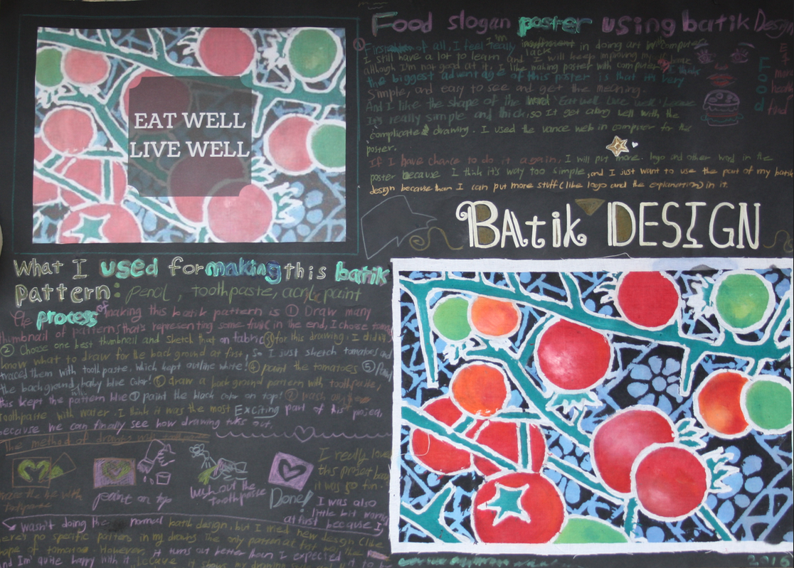
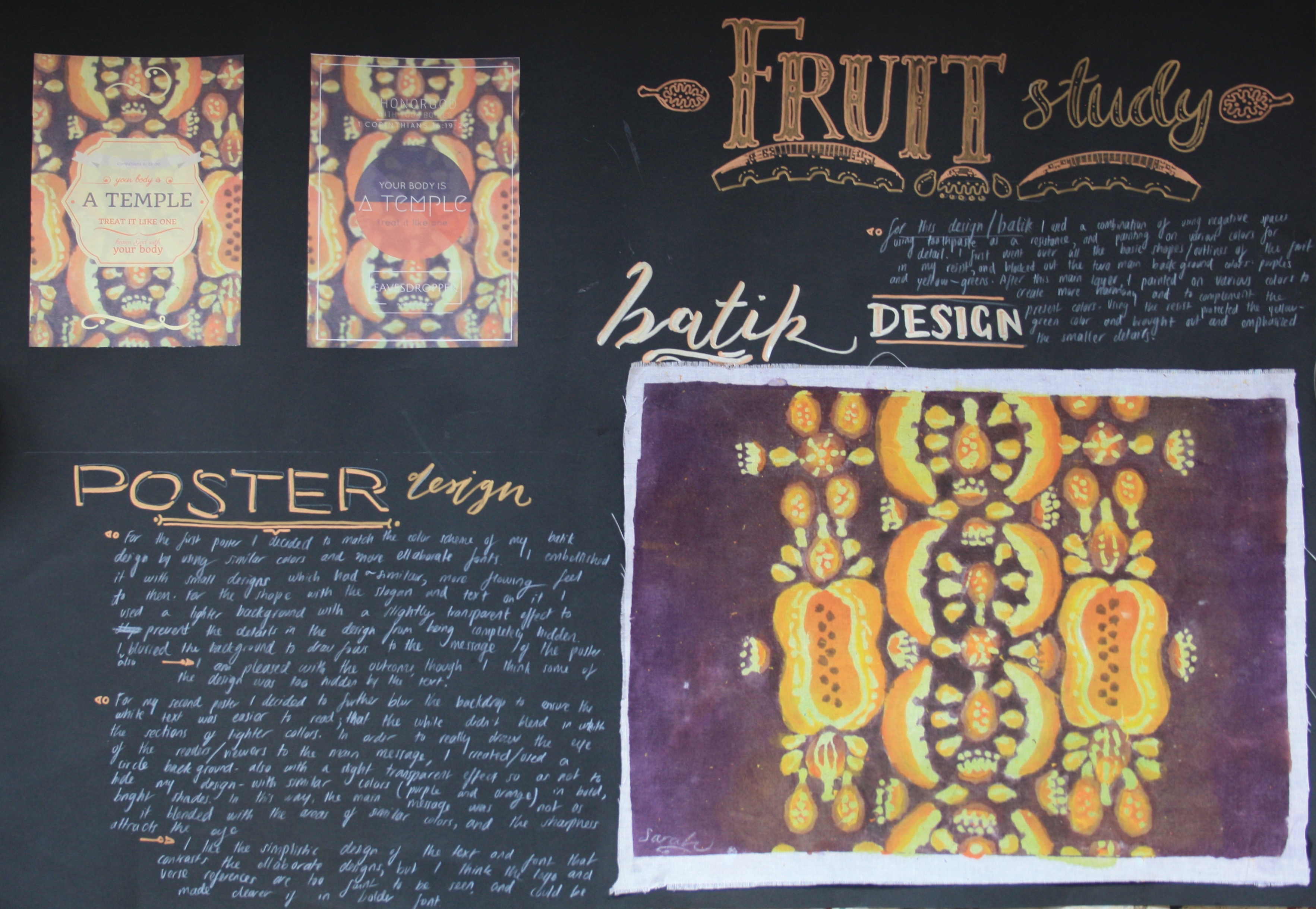
For week two of Careers in Art, students had the choice to take on the role of either a graphic designer, a fashion designer or a photographer. As a graphic designer, the task was to write and illustrate a self published zine, or Quaranzine; including both images and text in a handmade book made from one sheet of paper. To explore fashion design, students were challenged to create a piece of wearable art. This could be an accessory, such as a bag or watch, or an entire outfit. The only limitation was that it should be made from recycled materials such as paper or cardboard. To explore photography, we took inspiration from photographer Gregg Segal and his portrait series called Daily Bread. The task was to first collect items that have been important to students during quarantine and at home learning, to arrange these items around themselves and have their photograph taken. See further project details here.

Curator

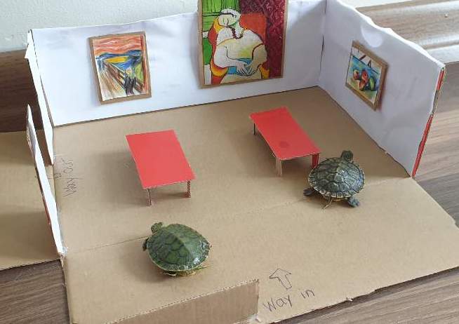
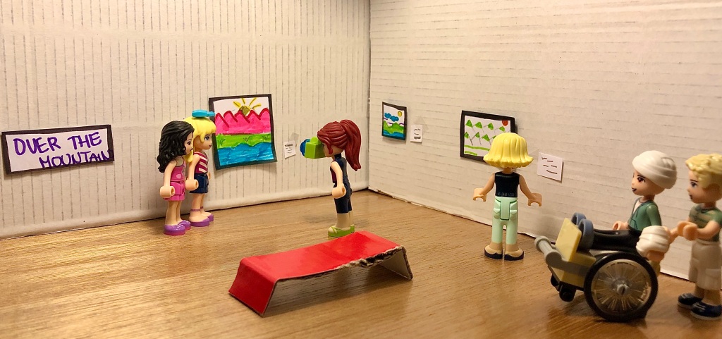
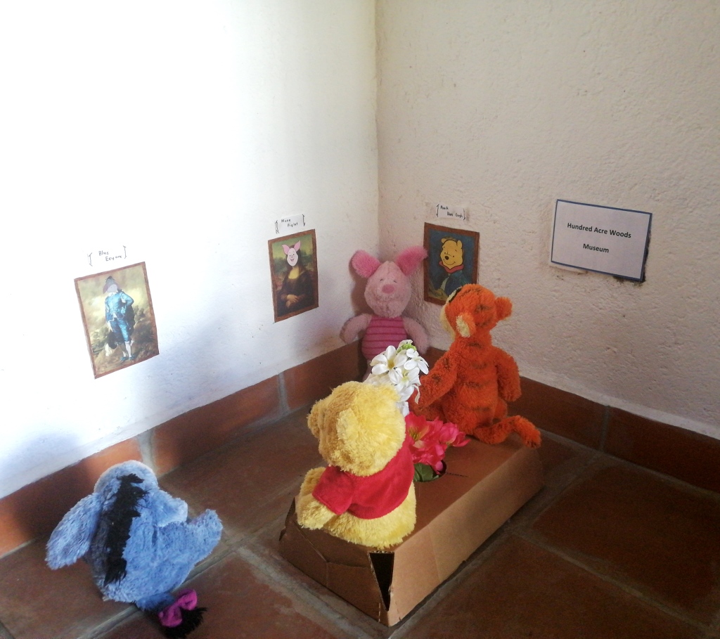
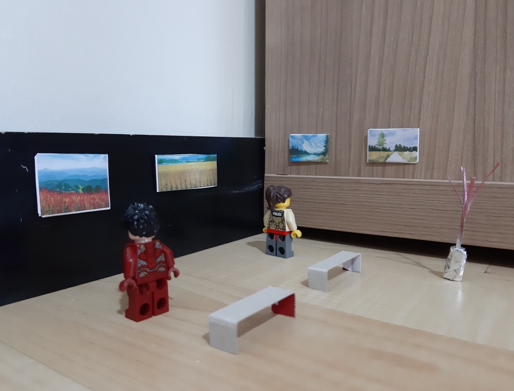
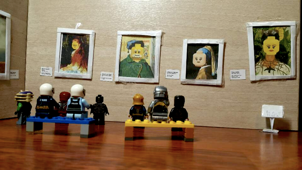
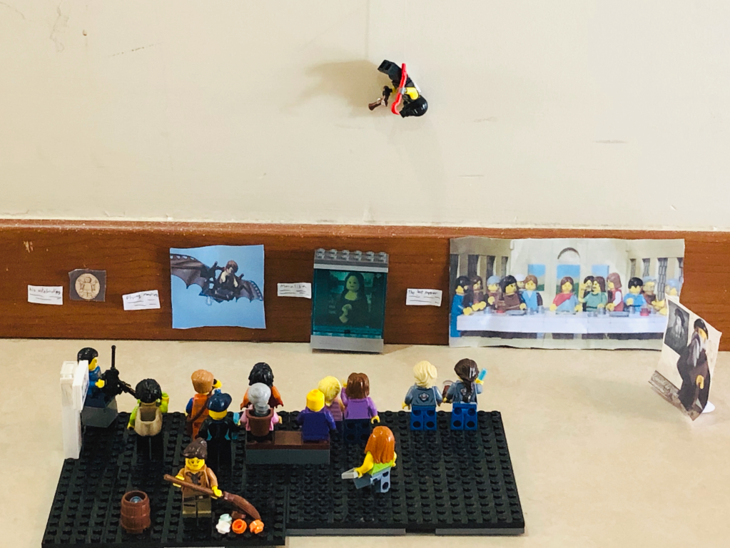
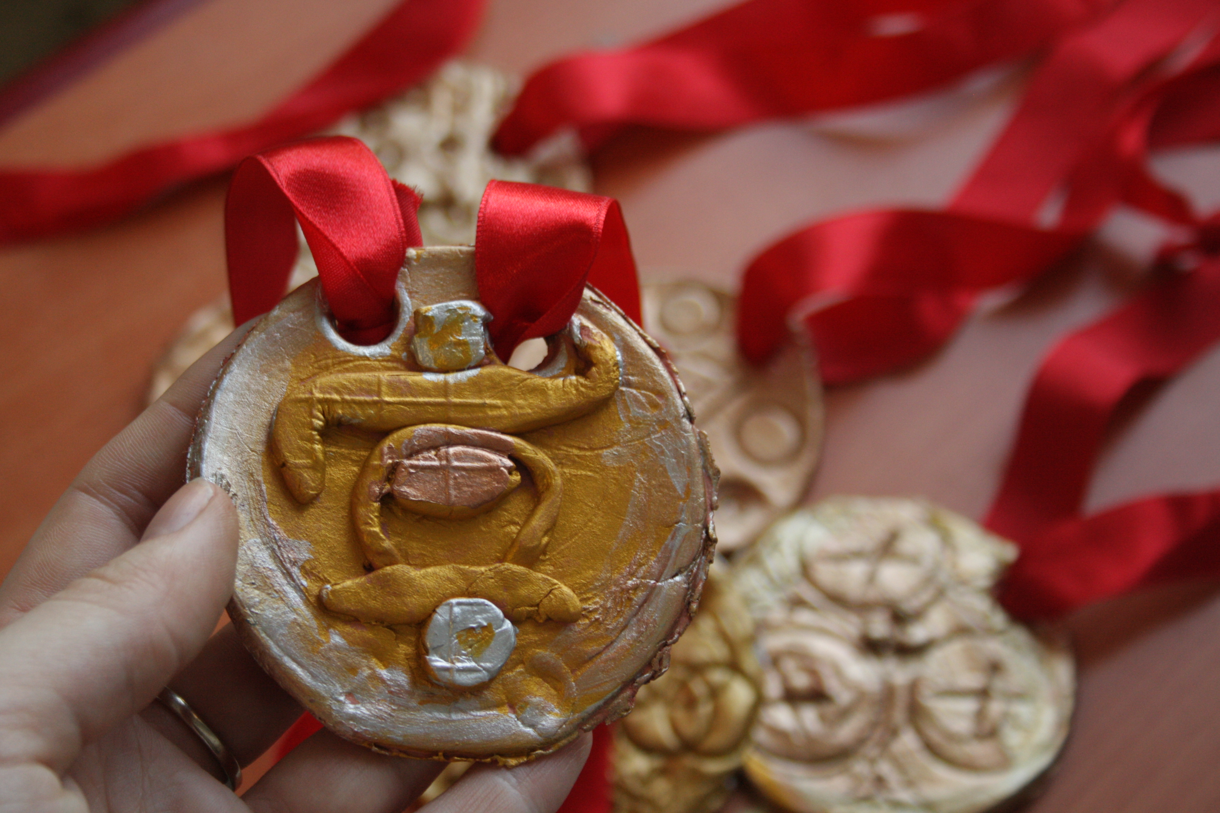
The final project was first to create a collection of miniature artworks that showed unity, and secondly, to organize and present this collection for display to an audience. The details for this project can be found here.

I am so proud of all of the work my students achieved during at home learning! I learned new ways to incorporate technology into my art curriculum and my students stayed engaged and participatory throughout each new weekly challenge, learning many new techniques and processes. I really enjoyed seeing the work they turned in each week, though I missed watching the creative process at work in the classroom.

Here’s to the end of the year, and the end of a season. A job well done, for everyone!

Dear Miss Twa

I have returned to this assignment after a few years. I always enjoy learning new things about my students. They are such a diverse group of TCKs; representing a mosaic of cultural backgrounds, languages and experiences. I had them write artist statements in the form of a letter to explain the symbolism within the finished pieces.

This one, for me, seems to best illustrate the Third Culture Kid experience; in both the division and blending together of two identities.

Art and the Olympics!

This year I wanted a theme for elementary art. In Canada (and in my family) we get really excited about the Olympics, particularly in the winter. Living in a country that is cold and snowy for the majority of the year… it is a necessity to take part in winter pastimes! This year’s Olympic Games also were exciting to talk about since they took place in Korea! The majority of my students are of Korean descent, though many have grown up here in Turkey.

We started with talking about what the games are- when they take place, how often, the teams from each country, different events for summer versus winter, the medals…

We looked at the visual symbols for the Olympics- the rings in conjunction with the logo designs for some of the past Games. I had both my high school classes and elementary classes make new logos.

This slideshow requires JavaScript.

Next we worked on a sculpture. First grade designed medals, second and third grade worked on trophies depicting athlete action poses, and fourth and fifth grade designed and sewed mascot plushies!

IMG_5557

Then the Art Olympic events! I used these events as opportunities to assess/review what the kids knew about the Elements of Art. We spent more time in first and second grade with the various activities, but all students across the grade levels were part of a team and could earn points.

IMG_5425
Texture Hunt/Colour Pull Activity

Ride Design

This was a project I did with first grade, resulting in much excitement and chaos! As a group, we talked about our experiences at amusement parks and playgrounds. The introduction took longer than anticipated with this talkative group, as everyone had something they wanted to share! I gave them the task, to design a new ride and sent them off to begin sketching ideas. Once the designs were drawn and coloured, students brainstormed a list of materials they might use to build a model. Out came my collection of recyclables, plasticine, straws and bottle caps- they were busy. It was so fun to watch them build and problem solve along the way. The completed models were painted using tempera paint.

We discussed how we could advertise these new rides, and looked at different theme park posters; identifying similar features. Students created posters to communicate a message, including a name for their new ride and a drawing of the completed model.

The Batik

This has to be my favourite project from last year’s curriculum- the batik

I started with a discussion on colour theory- introducing the colour wheel and colour schemes. Students did exercises in their sketchbooks, mixing oil pastels to create a colour wheel and two still life studies of fruit. I also had them conduct personal research outside of class on emotion and colour, as well as the meaning of certain colours in different cultures.

We looked at examples of hyperrealism and artists who create with high precision and detail. We compared and contrasted these examples with artists whose work is much more stylized. I then introduced the task: to create a pattern for a batik based on studies of fruit (students could use their previous studies or find other images for inspiration). The students began this task with drawing thumbnails of ideas, considering different shapes and arrangements in each composition. I also had them decide colour schemes for their final pattern.

I introduced the process of making a batik: creating a wax resist pattern, dyeing and repeating with additional details for each colour in the design. I decided last year, based on my limited knowledge and resources, that I would teach a faux batik technique. We used a combination of toothpaste and aloe gel for our resist which worked great. It was easy to rinse out of the fabric, and there was no tedious ironing of wax involved. Students drew out their chosen design onto fabric and painted the colours with fabric paint. This process drew out over several days, mostly because of the drying time. A few students attempted multiple layers of toothpaste and paint, others stuck to painting in between the outlines.

This project has an additional product. After the batik was finished, we dove into a visual communication design task: creating a poster for a healthy eating campaign with a message or slogan. Students chose a message that they wanted to communicate (which coincides nicely with the elementary project earlier this fall). This time around, I decided to give more up front instruction on choosing typefaces and layouts to create hierarchy in the design. In their sketchbooks, students collected samples of different typefaces and product advertisements; and began to thumbnail ideas. We had one class to create poster designs using an online design program. The next class, we had a critique and students made their final decisions of which designs to print. In typical IGCSE fashion (and to emulate a more authentic exam style situation),  students mounted their final pieces on poster board.

screen-shot-2016-12-07-at-10-10-53-pm
img_1388

Design-a-Chair

Several of this year’s eighth grade projects have involved drawing and illustration of some kind. I think both the students and I were ready for a change! I thought a problem based design challenge would be neat to try, giving them an opportunity to be creative and use their hands to build with new materials.

I allowed them to create their own project brief. Each student had to identify a specific consumer with a problem. We sketched initial ideas and made a list of possible materials before trying our hand at building a model.

Most of the students were fairly engaged throughout the building process. There was some trial and error. I did give suggestions for those that needed them, but for the most part they experimented on their own. I also had them write a reflection at the end, on their process of creating the finished piece.

The last step was my attempt to introduce a communication design component. We looked at examples of product advertising and discussed the target markets and how each was drawing attention. Each student did a thumbnail sketch first to plan out their design, which needed to include an observational drawing of their model in colour, and text to communicate a message/sell the product.

This slideshow requires JavaScript.

In introducing the project, I had referenced the Shark Tank and explained how each inventor pitches their idea to a group of investors. For our final class, we presented our finished posters and designs to the group. Each design was scored by a panel of peer reviewers and could get a certain number of points in each of three categories: Creativity, Craftsmanship and Presentation. The students also gave each other positive and constructive feedback-an important part of the artistic process! At the end of class, we voted on a top scoring design for each category and one overall design.

Poster Design

I did it… I decided to take a leap and delve into the field of design. We began our unit with mini lessons on typefaces and layout. With limitations of technology, we used old magazines to identify differences in type and find different layouts of type and image used in advertising.

The project paired students in groups to work in a real life design situation… designing posters for the upcoming middle school play, a radio theatre broadcast. The students brainstormed and came up with idea sketches which were discussed with me before they took their ideas to realization. I was impressed on how well everyone worked together, as I have never attempted group art projects before- and equally proud with the finished designs.

This slideshow requires JavaScript.

Mobile Art Teacher

bucket1Today was day one of teaching in my makeshift classroom. I was able to haul down most of my supplies to a designated corner of the multi purpose room, however I soon realized there are so many things I take for granted when I teach! For today’s lessons, I had to make do without my whiteboard, rulers, a nearby sink… we made it work. While the space was dim and damp, I enjoyed being right next to the music room and partaking of a mini concert during my break. Midday, I decided it was easier to travel up to my kinder and first grade rooms for their lesson. Fortunately these two rooms are next together and I only needed the same simple supplies for both groups. This was the smoothest part of my day- it makes so much sense to have them sit and work at their own desks that are the right size for them!

Here are a few of our creations from today. We started with written letters of the alphabet and transformed them into colourful, imaginative playgrounds.

This slideshow requires JavaScript.