Ming Vase Designs

I am back teaching in Turkey for the semester after a long hiatus! I greatly missed this city and my students. It is a blessing to return, I feel refreshed and renewed for this next season. This semester, I am teaching elementary 3rd and 4th grade. I have not taught this group of kiddos for two years… they have grown up so much since then!

I have taught this project before, but as is true in teaching, you never teach the same thing twice! It HAS been a challenge starting out with these groups, who are split according to their language ability. One group of 3/4’s have higher, near-native English language proficiency, whereas the other, larger group of 3/4’s are English language learners (or ELLs).

Teaching ELLs in the art room has never been a huge challenge for me, as there are usually enough peer models around, and the nature of art class is very visual! Students usually do not have problems following along, even if they do not understand all of the directions for a project. I also have some background in teaching ELLs during my student teaching in Canada- I think integration of the content of art, alongside language is a perfect scenario for students to learn English!

I have found that since the two classes are grouped according to language ability, I am teaching them very differently. Keeping both groups on the same page (in terms of content) while making efforts to emphasize content language learning… this all takes a bit more thinking and additional planning!

I first showed the classes a video of how porcelain Ming vases are made, from start to finish. This sequencing is important, especially as we are moving onto clay for our next project!

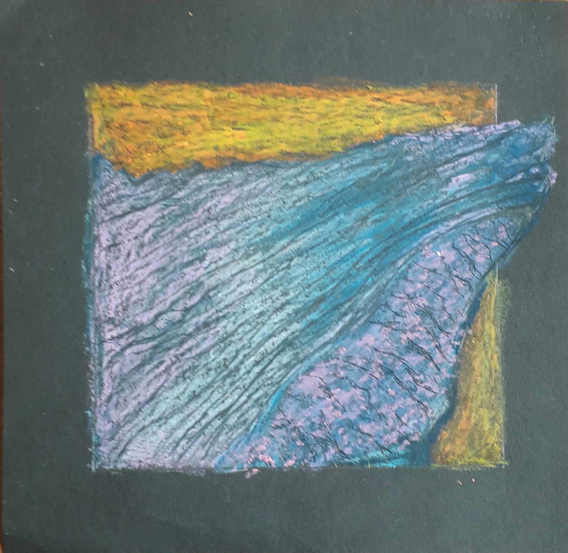
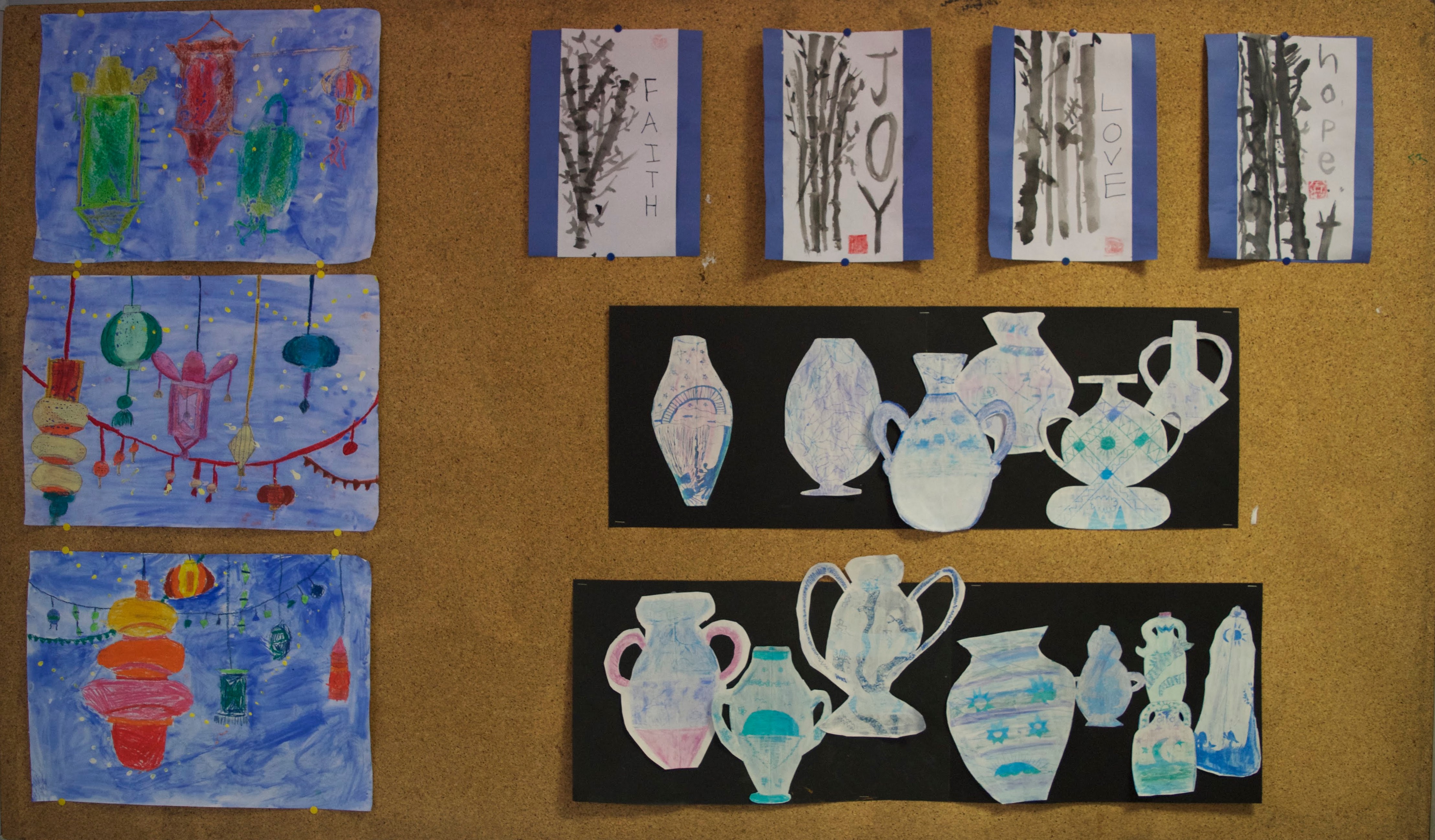
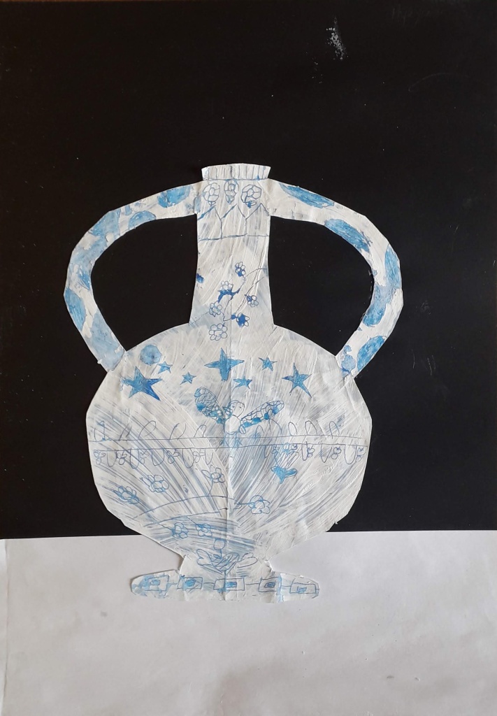
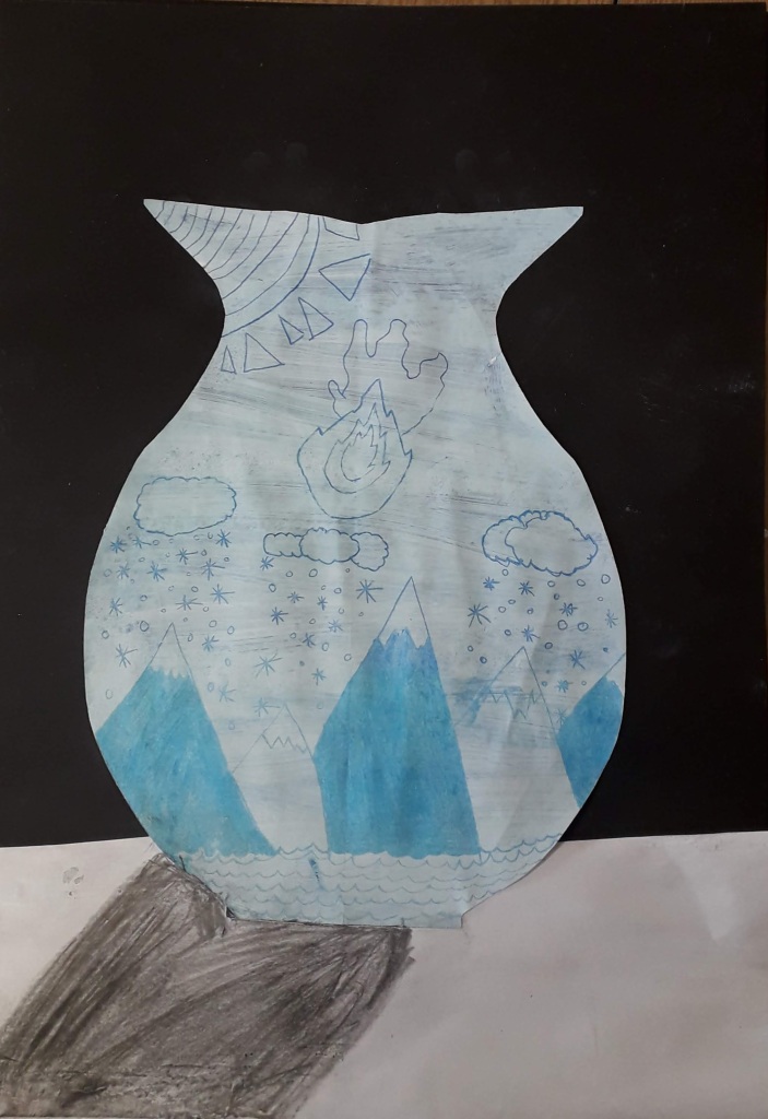
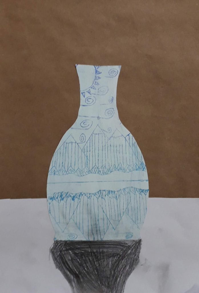
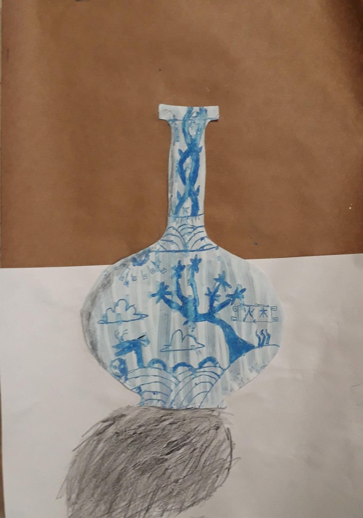
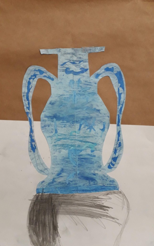
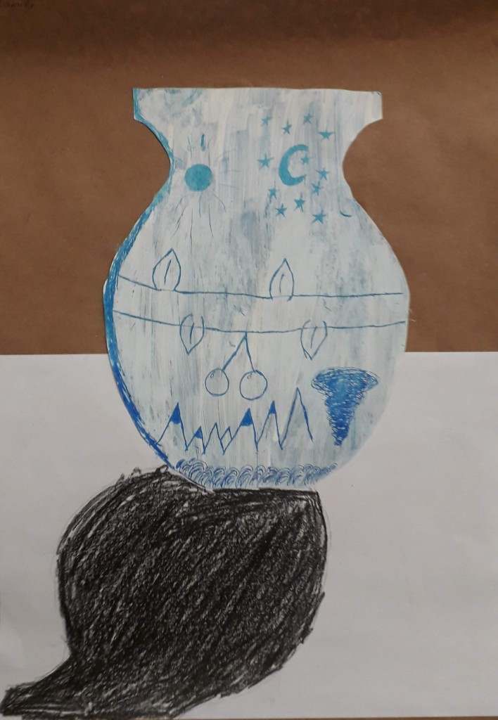
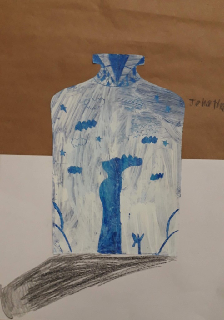
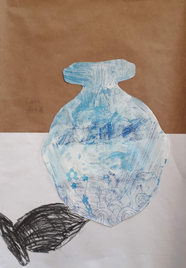
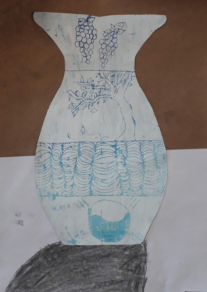
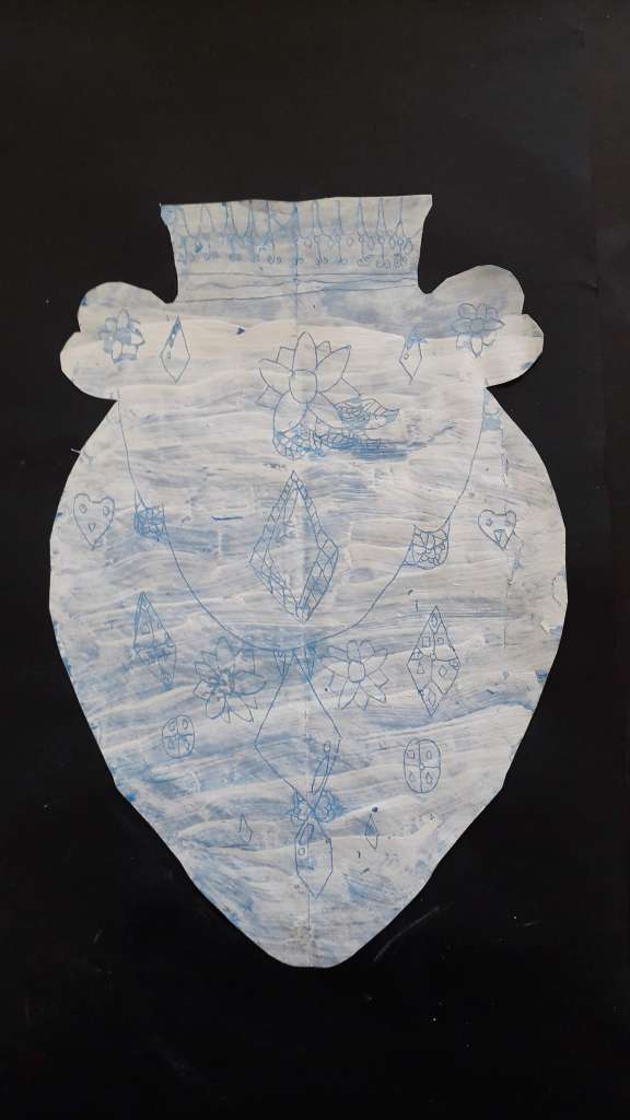
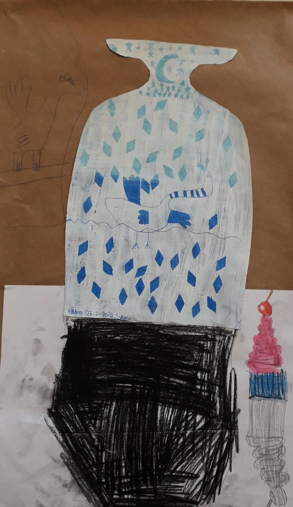
We started off with looking at different vase shapes, discussing the forms and symmetry of the different designs. I demonstrated how to create a symmetrical vase shape on A4 paper – making a hot dog fold, drawing along the edge of the fold to create an outline and cutting it out so the two sides of the vase are the same.

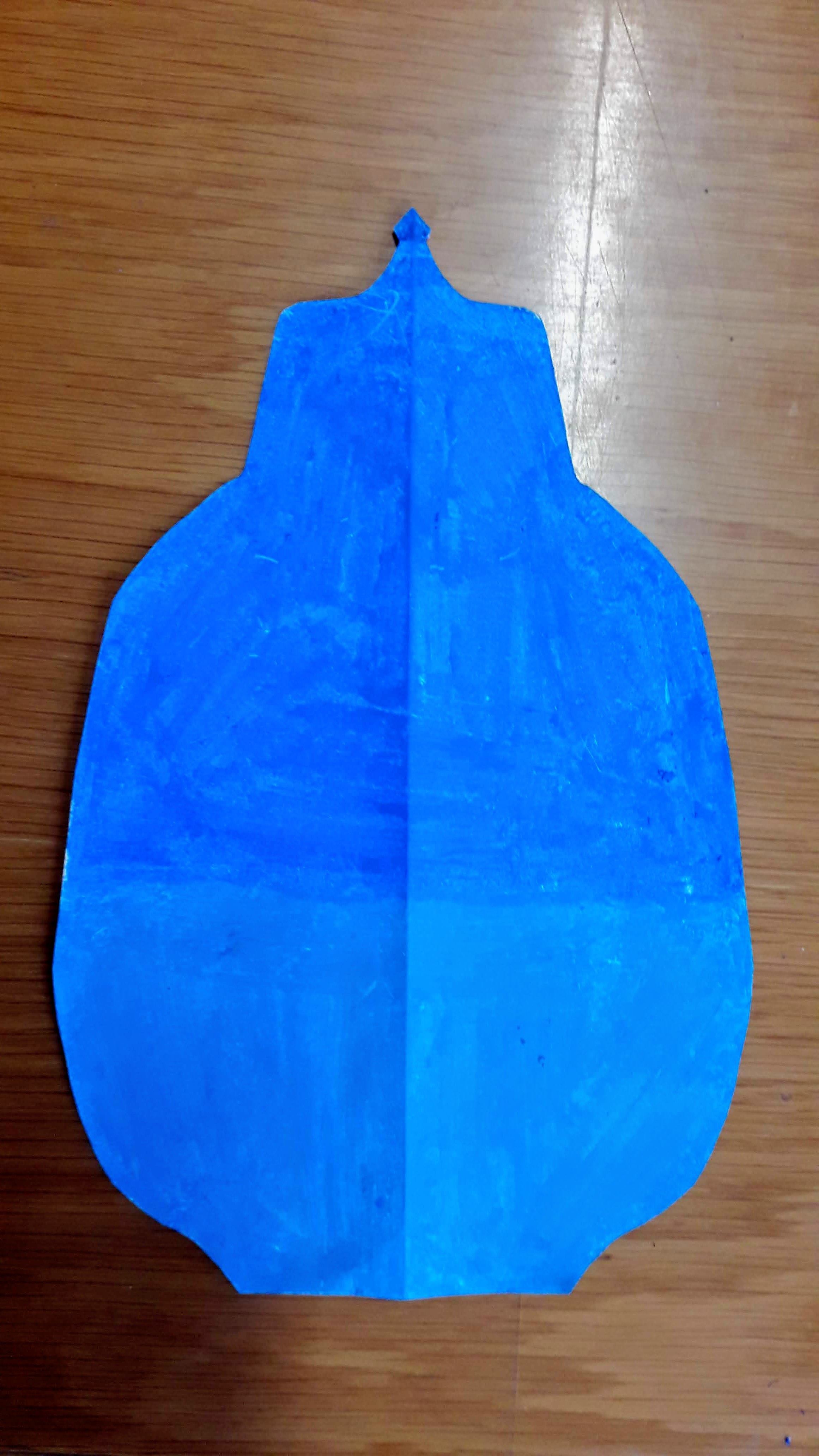
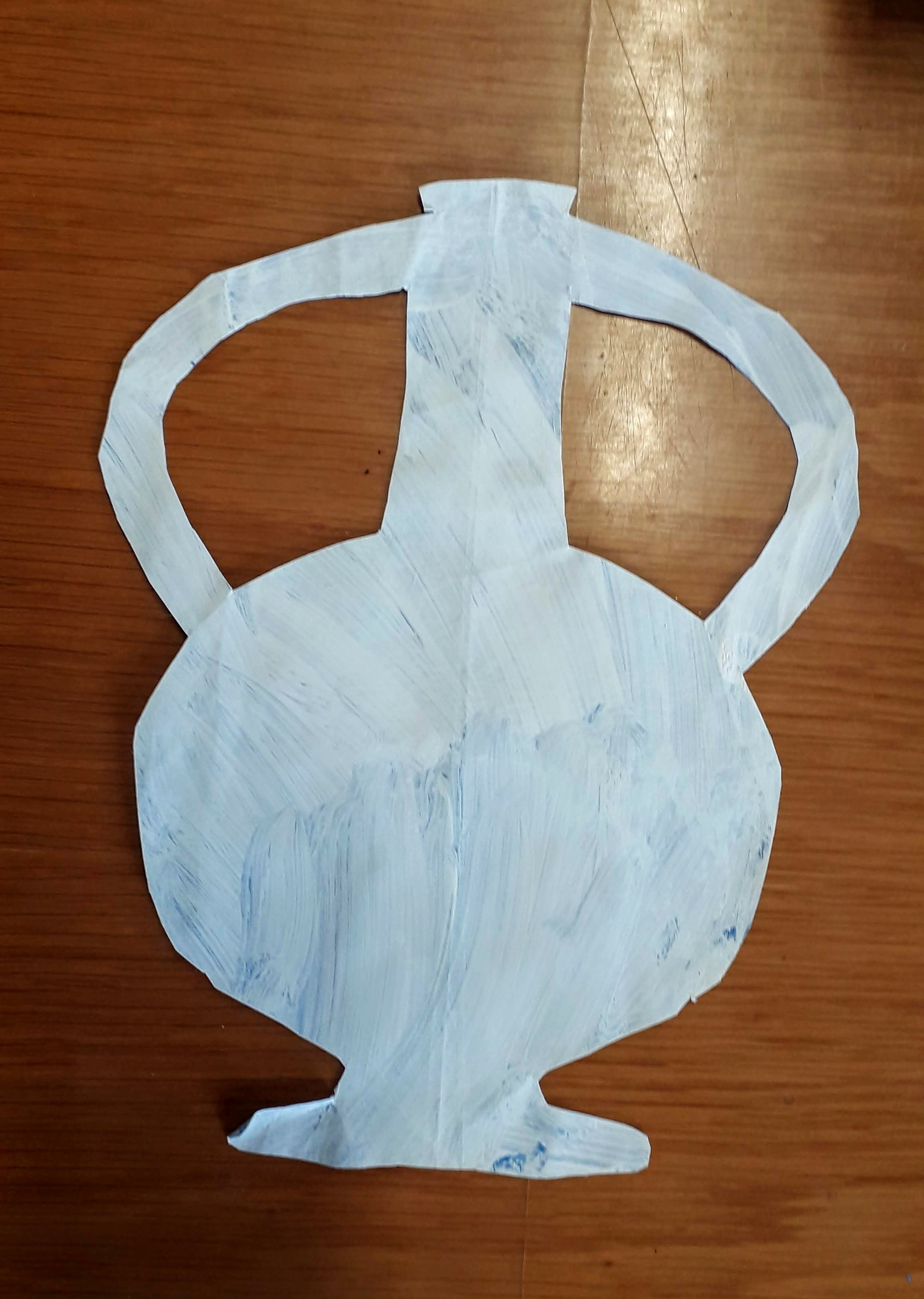
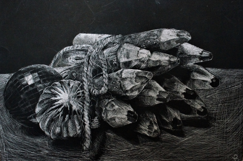
  • Step One- Fill in the silhouette shape with different values and shades of blue oil pastel
  • Step Two- Paint overtop of the blue with a layer of white tempera paint mixed with soap (this is so the paint sticks better to the oily pastel layer)
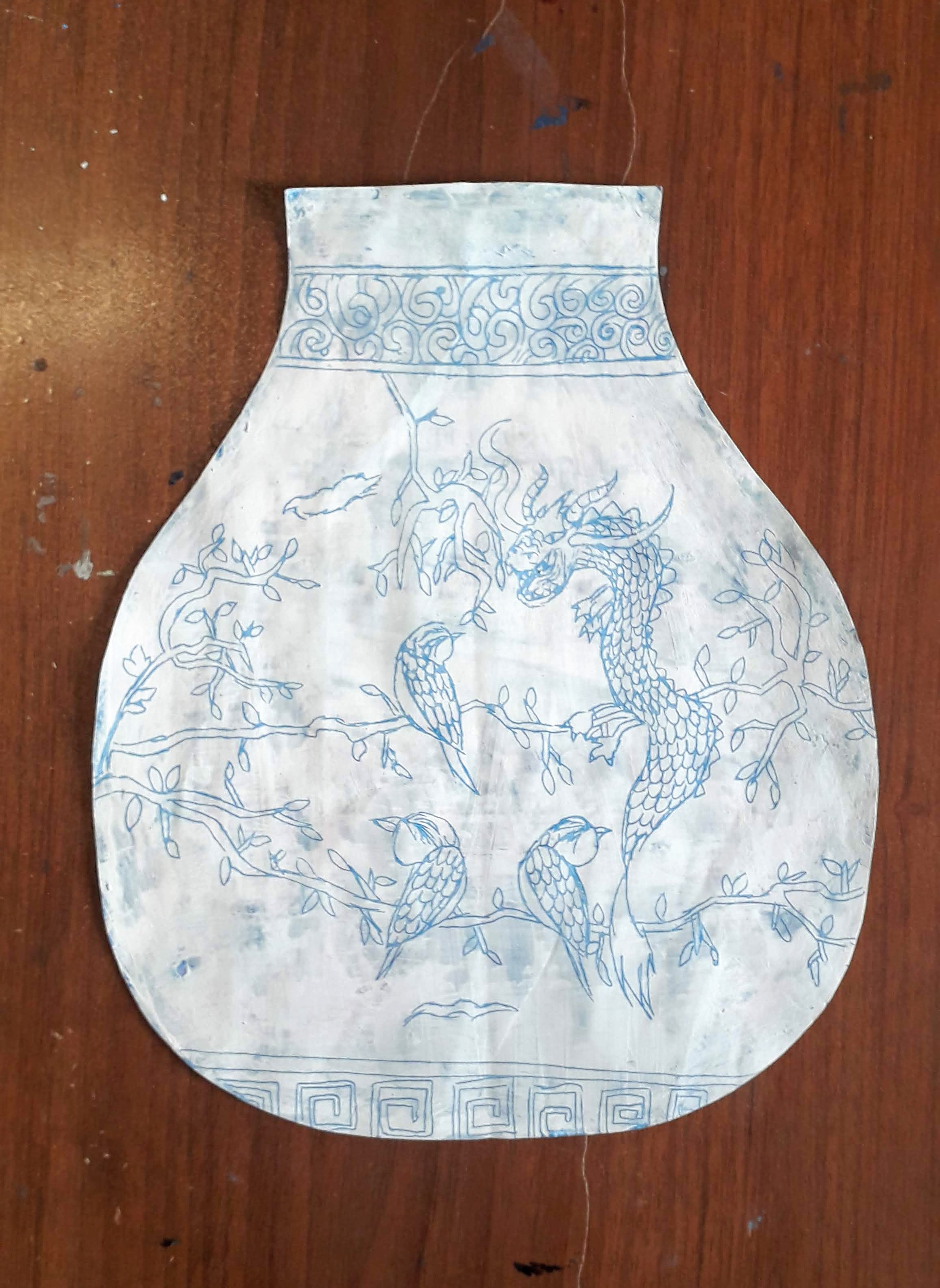
  • Step Three- Scratch a design through the layer of white paint and reveal the blue underneath

We spent some time looking at and discussing the different imagery used to decorate Ming vases. We talked about symbolism and possible big ideas that are being communicated through the work. We learned that the artisans use cobalt to draw onto the vases before they are fired, and only after coming out of the kiln do the designs turn out blue!

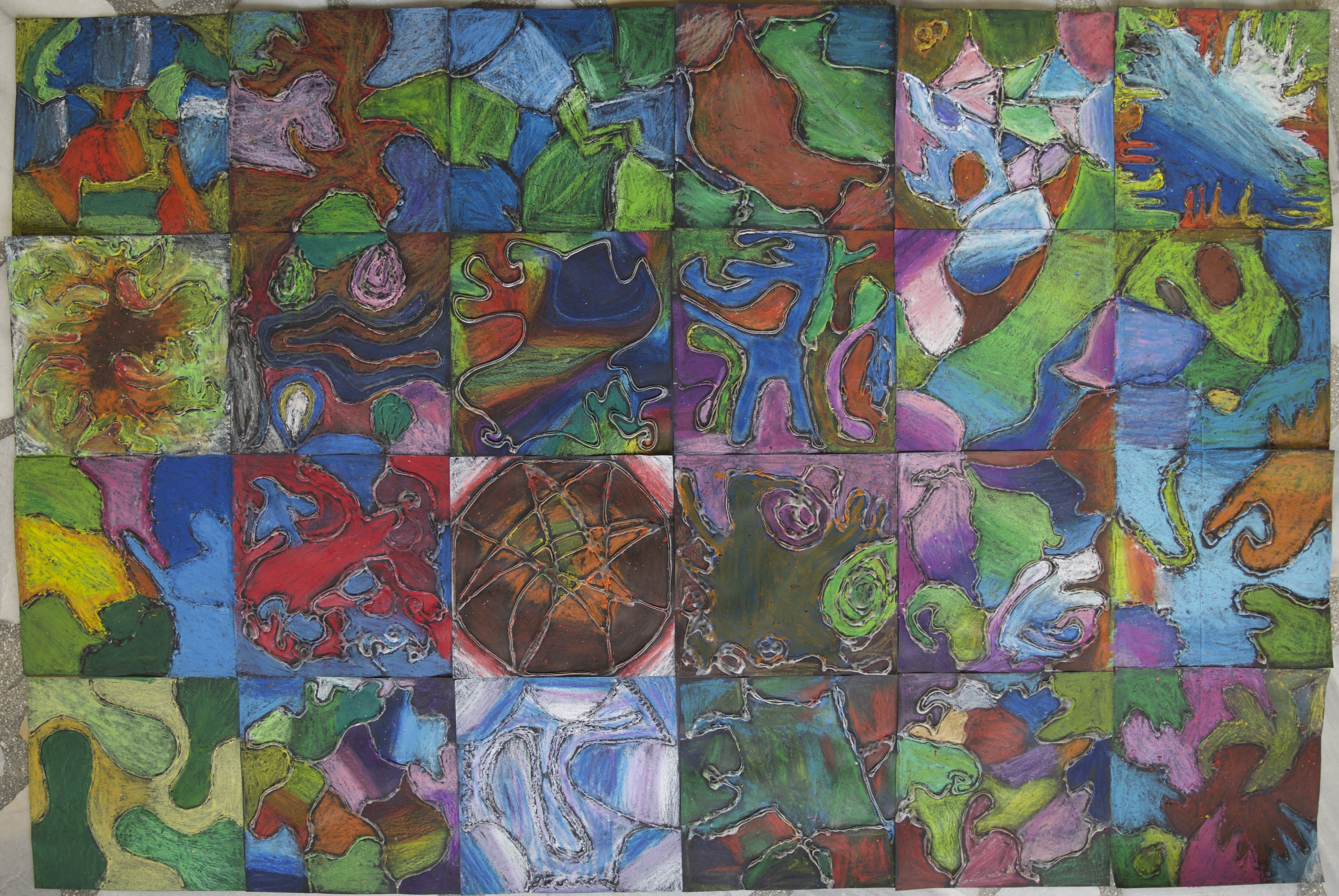
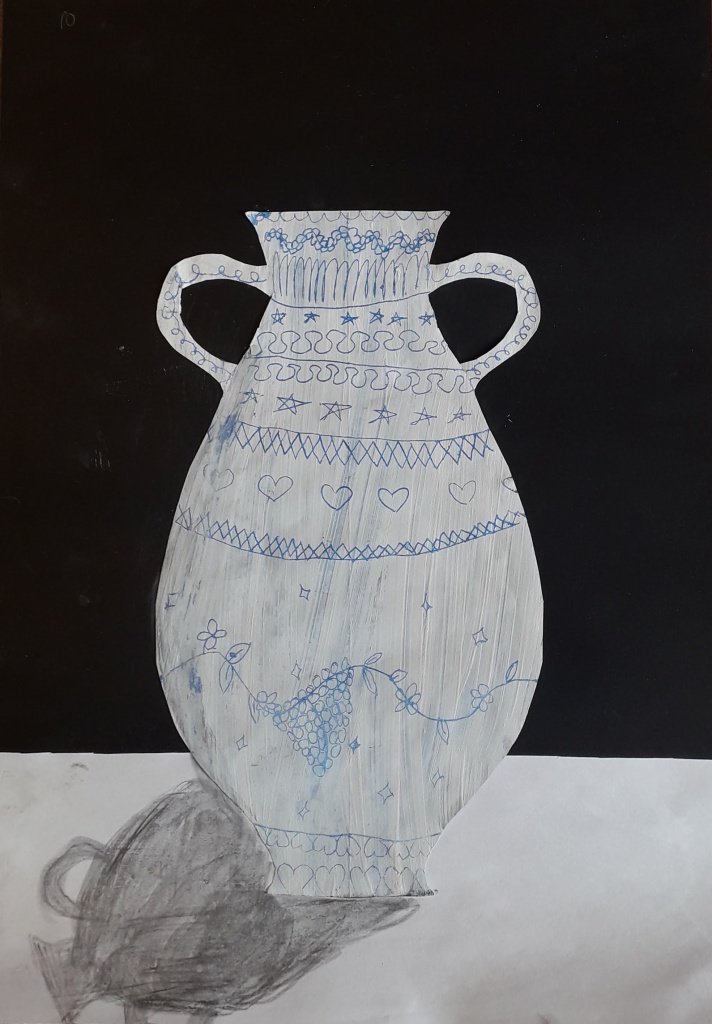
After planning in their sketchbooks, students began scratching their designs onto their vases. Finished designs were mounted onto black or brown paper. Another challenge I am facing now more than ever, is having students all on very different steps of a project. Early finishers had the opportunity to add a table surface and an indication of light and shadows on their vases. They drew in the shadows using graphite. I did not give them very much instruction on this, it was insightful to see how they all interpreted this differently on their own!
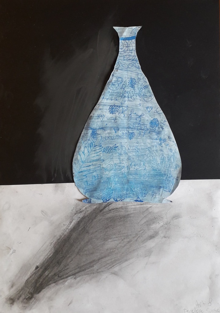
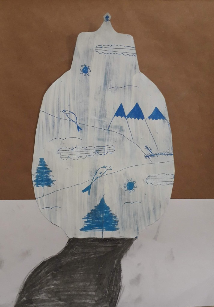
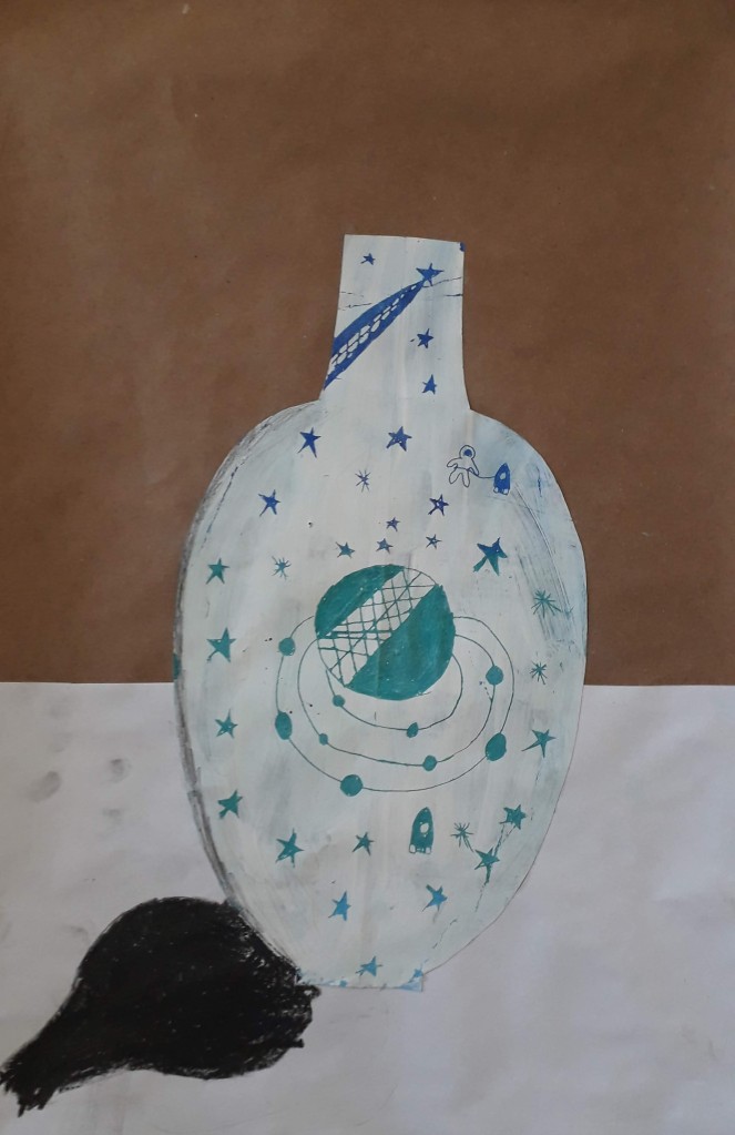
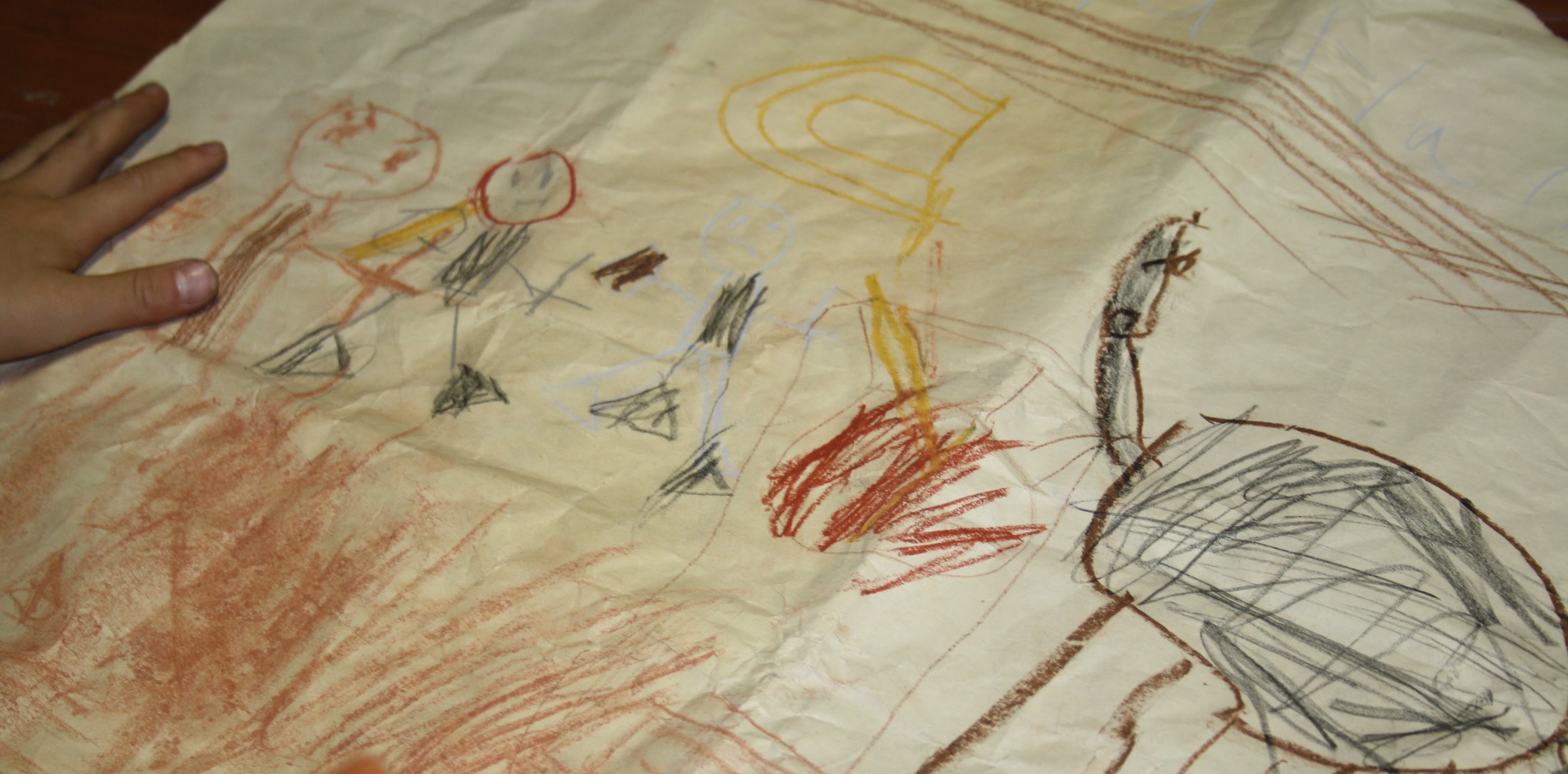
4 Years of AP Art!

I am in a very reflective mood. This year, I taught my fourth group of AP artists. It is SO good for me as an educator to see how far I have come in my abilities to teach and mentor students at this level. I could not be more proud of these girls and the hard work they put in for the scores they received.

Throughout this year (and second semester in particular), I aimed to make the class really special, and to cultivate a collaborative learning environment beneficial for both me and my students. I knew this might be my last time teaching the class for a while!

I thought I would share a few of my favourite projects over the years- the AP art program is going through some big changes this next year, so I may not have the chance to use these again!

Zines

As a final assignment, I introduced my students to the world of zines

A zine is a handmade, small circulation self-published booklet of original or appropriated text and images. Zines are a product of a single person or a small group, and are easily reproduced into physical prints via a photocopier for distribution to a wider audience.

We started out with brainstorming a list of topics- zines can be made about anything! I asked them to consider what was important to them, what message they wanted to share with the world; as our zines would become the vehicle to get art into the wider community. Students then chose a topic from their lists and broke it down into subtopics, thinking how they would create content for an 8-page booklet.

Each student created a thumbnail plan in their sketchbook first before creating a master copy. I showed the students how to create an easy booklet from one sheet of A4 paper. Students explored combining drawing and handwriting with collaged imagery and text. We also discussed variation of line weight and value. Students traced over their final pages with black pen, some even added a mid tone gray with pencil to create a greater range of contrast for photocopying.

Alas, time always runs short at the end of the year. Although we discussed how we could distribute and share our finished works with the community, only a couple of students could finish and make copies for the public. Here are a few that we had out for our fringe festival at the end of May.

I really love this project as a final summation to the year- an opportunity for students to share their voice and own unique style developed over the course of a year.

Pastel Compositions

We started this new semester in middle school exploring the medium of pastel. I had the students try different techniques for applying pastel, including blending, colour mixing, stippling, scumbling and sgraffito. Seventh and eighth grade students chose an object to explore and created several thumbnail drawings before deciding on a composition. These compositions needed to be cropped in close to the object so that it touched at least three sides of the paper. Colour and value were added to the drawings using a chosen group of analogous (not local) colours, and the background with a complementary colour.

Fifth and sixth grade students created abstract design blocks, tracing their line design in glue. Each block had the same entry points on each side so they could connect into a collaborative work. Students explored blending with pastels, and used analogous colour schemes to fill in each section of the design.

Above is the collaborative work fifth grade put together as a present for one of their teachers, who is also my co-homeroom teacher.

Let Your Light Shine

We travelled to a country further east around Christmas time. It is not a country that celebrates Christmas, but this became a good topic of conversation in my classroom. In China, they DO celebrate New Year, which is more similar to what is celebrated here in Turkey.

First and Second Grade:

We looked at the Chinese lanterns used in decoration at New Year. First we practiced drawing different types of lanterns in a step by step guided drawing, and later worked independently to create our own composition of lanterns. We discussed drawing to fill the whole space on the page, with bigger lanterns in the front and smaller ones behind.

I introduced my students to value and analogous colours so we could create lanterns that popped off the page. The goal was to get them to use a light, medium and dark version of a colour within one lantern.

After tracing over all of our pencil lines and colouring in each of our shapes, the students painted the background with blue tempera paint. The pastel resists the paint, so we needed to make sure all the white space was coloured in!

The final step was to create dots/strings of light with yellow and white in the background. Students printed these with the end of a paintbrush.

Fourth Grade:

We studied the art of sumi-e brush painting. First we practiced holding the bamboo brush and making different types of strokes. The next class, we put our practice to the test and painted compositions of bamboo. The students chose one word/fruit of the Spirit-love, joy, peace, hope, faith- to write vertically down one side of the paper. Our final class, I had the students design a signature chop (from foam) to sign their finished piece, and then mount the finished works on construction paper.

Fifth Grade:

Fifth graders looked at the art of porcelain Ming vases. We discussed the variety of different shapes and silhouettes. I demonstrated how to create a symmetrical vase drawing with two sides that mirrored each other. These pencil outlines were filled in with different shades of blue pastels. The next class, we painted over the pastel layer with white tempera, and made drawings of design ideas for our vases. During the final class, designs were scratched into the paint to reveal the blue layer underneath. Vases were cut out and mounted together in a composition on black paper.

This slideshow requires JavaScript.

DSC_0015

Artists Communicate: Cave Art

IMG_4614

I have had students drawing in caves for two weeks! We are beginning our art through culture units with exploring the very first art ever found.

As students came up for art, they were welcomed into the CAVE. I had all the curtains drawn so the room was dark- except for the images on the projector. I told them we were going on a tour of Lascaux cave in France- the same cave that a few teenagers also explored many years ago and come across something. We watched this video and I asked students to keep an eye out for anything surprising.

After watching, we discussed the drawings we saw. What subjects were drawn? Who do we think drew them? What materials do we think they used? We talked about the people that lived in caves- some of my students have visited  caves in Cappadocia where people lived in the past, and the cave homes people still live in today. We discussed the information these drawings give us about how people lived back then and the stories they tell us.

I gave students scraps of paper to practice drawing with our materials: chalk and oil pastels, crayons, conte and charcoal. I had them start thinking about what was important to them and what story they might want to tell through their artwork.

We did our drawings like the cave artists: up against the wall, taped to the underside of a table or chair, or on the floor- and we used flashlights to help us see.

IMG_4612

After practicing and drawing initial ideas, students began drawing on bigger sheets of paper. Most of this paper has been sitting my shelves for quite some time and already shows some wear and tear. But I showed students how to rumple the paper to achieve a more rock-like texture.

Finished drawings need to tell a story or communicate something important to the artist. They also need to demonstrate the following elements of art: line, shape, colour, texture and value. Stay tuned for the display of our finished cave drawings!


Introducing Scratchboard

Here they are, the long-awaited scratchboard drawings! Despite the fact that we practiced with white pencil with black paper, the process was still difficult. Perhaps I was a bit too ambitious to introduce the concept with middle schoolers, but some of them did get it! It was hard for them not to outline each of the shapes and instead separate shapes through the building up of values. This requires patience, and some of my students need stretched a bit in this area- to slow down, think and work more carefully. Here are a few of our finished accomplishments.

This slideshow requires JavaScript.


White on Black Drawings

I wanted to introduce my eighth graders to scratchboard- paper coated with white clay and sprayed with a layer of india ink. Before starting on scratchboard, it was important to have them practice drawing objects and areas of light on a dark background. This way of drawing white on black works opposite of the way we draw with pencil on paper. Instead of drawing a visible outline of an object, I wanted them to fill in areas with the values they saw. I set up still life arrangements of white, geometric objects, and gave them white coloured pencils and black paper. We discussed different techniques we could use to show the varieties of white present, including varying the amounts of pressure, types of mark making and the proximity of the lines. These are what they came up with.