Oceania Masks

Our school celebrated international cultures week mid-April. Within the student body, we have representatives from 24 countries! It was a busy and exciting week with a whole-school assembly, musical performances, cultural games and a potluck lunch. Amidst the flurry of special activities throughout the week and the themes of celebration and diversity; we looked at masks.

We talked about the reasons why people wear masks and where they get their inspiration from. We looked at masks from Papua New Guinea, discussing the colours, shapes, patterns and textures we observed. We also discussed the differences of symmetry and asymmetry in the designs.

Everyone started with a cardboard base. We talked about building a relief using different textures, shapes and layers.

Once the masks were complete, we painted them. The final step was to add pattern and detail with pastels.

This slideshow requires JavaScript.

Textile Patterns from Ghana

After our unit in the caves, we flew off to a new country in West Africa; Ghana.

In first and second grade we looked at Kente cloth patterns

We started with making two patterned papers.

img_4775.jpg

1. Printed gold patterns on black paper- we made printing blocks by wrapping twine around sponges

2. Painted geometric patterns using colour, line and shape


Once these papers were finished, we wove the two patterns together to create a new and intricate pattern. The black paper became our warp and the coloured was the weft strips. Weaving always goes over great- I did it with both groups last year, so this was review for most. We talked about how Kente cloth is used to make new clothes for special occasions and thought about what occasion we would make our designs for; a few students wrote artist statements about the meaning behind their finished pieces.

IMG_4904

Third through fifth grade focused on the Adinkra symbols found on Kente cloth

We looked at examples of symbols and their meanings; and watched an artist through the process of stamping a design on cloth.

I gave the students sheets of ideas of existing symbols and encouraged to make a design of their own. They glued foam shapes onto a cardboard base.

The printing of these designs was exciting! Even after printmaking with classes this long, I still strive to make the process run more smoothly. I set up a long table in the middle of the room for inking, and each student at the remaining four tables had a number. When it was their turn, students inked their stamps in the middle and then returned to their tables to print. I encouraged them to rotate the stamps to create variation in their design and also incorporate a second symbol.


Radial Mosaics

I did this project with first and second grade following a weaving unit in which we practiced linear patterns (top to bottom, side to side).

I never thought I would be one to do macaroni crafts, but these turned out as a perfect material for mosaics! I had many varieties of beans, seeds and pasta stashed away and this was the perfect opportunity to use them.

As a class, we looked at examples of radial patterns– patterns that go around in a circle. All of the examples were from places in the Middle East- the Blue Mosque and Aya Sofya being two I knew many of them had visited. We then looked at examples of mosaics from further afield in Ephesus and Kapadokya.

I decided to use these CD inserts I had, which have a perfect circle template for placing little seeds. The goal was to completely fill the circle, covering the background in the creation of a radial pattern. I love how, when placed altogether, the individual pieces are unified through the use of natural colours.

IMG_4902

The Batik

This has to be my favourite project from last year’s curriculum- the batik

I started with a discussion on colour theory- introducing the colour wheel and colour schemes. Students did exercises in their sketchbooks, mixing oil pastels to create a colour wheel and two still life studies of fruit. I also had them conduct personal research outside of class on emotion and colour, as well as the meaning of certain colours in different cultures.

We looked at examples of hyperrealism and artists who create with high precision and detail. We compared and contrasted these examples with artists whose work is much more stylized. I then introduced the task: to create a pattern for a batik based on studies of fruit (students could use their previous studies or find other images for inspiration). The students began this task with drawing thumbnails of ideas, considering different shapes and arrangements in each composition. I also had them decide colour schemes for their final pattern.

I introduced the process of making a batik: creating a wax resist pattern, dyeing and repeating with additional details for each colour in the design. I decided last year, based on my limited knowledge and resources, that I would teach a faux batik technique. We used a combination of toothpaste and aloe gel for our resist which worked great. It was easy to rinse out of the fabric, and there was no tedious ironing of wax involved. Students drew out their chosen design onto fabric and painted the colours with fabric paint. This process drew out over several days, mostly because of the drying time. A few students attempted multiple layers of toothpaste and paint, others stuck to painting in between the outlines.

This project has an additional product. After the batik was finished, we dove into a visual communication design task: creating a poster for a healthy eating campaign with a message or slogan. Students chose a message that they wanted to communicate (which coincides nicely with the elementary project earlier this fall). This time around, I decided to give more up front instruction on choosing typefaces and layouts to create hierarchy in the design. In their sketchbooks, students collected samples of different typefaces and product advertisements; and began to thumbnail ideas. We had one class to create poster designs using an online design program. The next class, we had a critique and students made their final decisions of which designs to print. In typical IGCSE fashion (and to emulate a more authentic exam style situation),  students mounted their final pieces on poster board.

screen-shot-2016-12-07-at-10-10-53-pm
img_1388

Symmetry Tile Design Unit

It has been two whole years since I taught all of the elementary grades. This year, one of my goals is to teach a topic across the grade levels- scope and sequence here I come!

K/1 paper symmetry designs

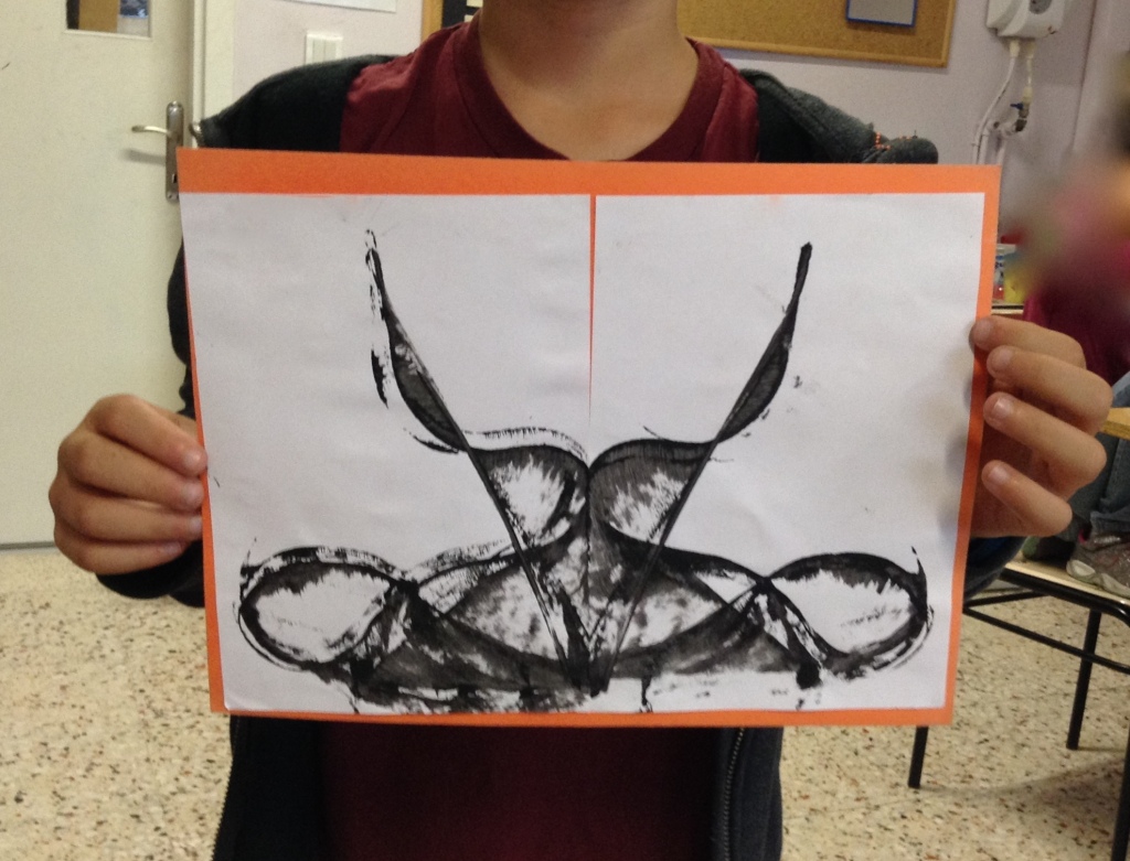
The kindergarten and first graders looked at examples of symmetry patterns in quilts. We did a lot of practice together first- creating symmetry with wooden shapes on the carpet and drawing collaboratively on the white board. I had the students fold their squares into four sections- whatever paper shapes they put into one section, had to be repeated in the other sections. Some of the students understood to mirror the design along lines of symmetry, others did not quite get the concept. The first graders finished sooner and had time to add extra detail with line overtop of their paper designs.

2/3 pastel symmetry resist and colour wheel

This slideshow requires JavaScript.

I had them draw a pattern using shape and line in three sections of a circle diagram. We then folded the circle so the pattern was on the inside. At the windows, I demonstrated tracing overtop of the lines (with pencil) to create a transfer of the same pattern onto the remaining three sections *insert gasps of awe and wonder. The next lesson we discussed primary and secondary colours, mixing and painting them into the sections of the circle. The pastel design underneath created a resist and mostly showed through tempera paint. The final step was cutting out the painted circles, mounting them on black paper and using pastel to create a line design around the edges to frame the finished pieces.
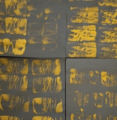
img_5389String Painting

A bonus activity I tried with 2nd grade. While chaotic and messy, it was worth it to see their reactions when the papers came apart to reveal each print… and to hear that they were talking about it long after the class!


and a second project…

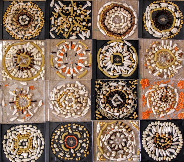
2/3 3D radial sculptures

I did this project a couple years ago with 6th grade. I decided to try it with a younger age group since the kiddos are always asking for paper to make folded creations. I taught them a few basic folds to get them started, and we folded the background squares to create lines of symmetry. Any shape added to the design had to be repeated in adjacent sections Some of them got the concept of radial symmetry, I was content to let others make two halves of the design that mirrored.

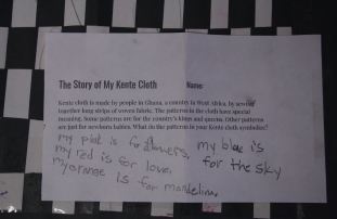
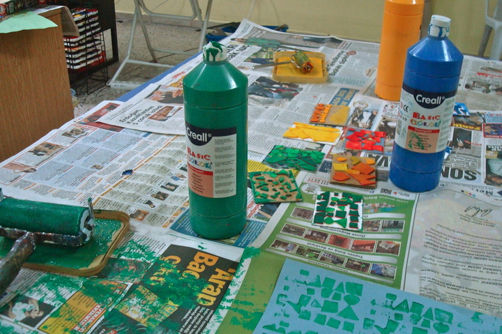
4/5 radial name design and colour schemes

Previously, in high school, I have done a similar project with colour schemes and the students each come up with their own designs. For this version, students practiced writing their names in many styles before choosing one to draw and transfer to each section of their tile to create a radial design. We then spent several classes learning about and practicing colour schemes, including: primary, secondary, warm, cool, monochromatic and complementary. Each section of the tile is painted using a different colour scheme- 6 in total with two repeats (though some students were eager to learn new schemes- neutral and tertiary). These ones are taking us a while, here are the finished ones so far!

Portraits

This week I finished a favourite project of mine with the kindergarten and first grade: self portraits! They always make me smile. We did our drawing first in black pastel, then painted the shirt, background, face and hair. Once the paint dried, we added detail to the face and shirt using coloured pastels. We also filled in our backgrounds with pattern, using line, shape and colour, which was a great review of previous learning!

This slideshow requires JavaScript.