Value vs. Colour

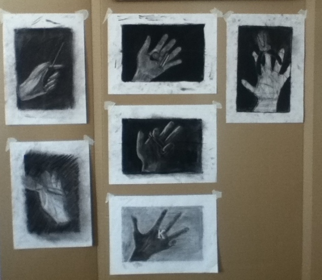
I am trying sketchbook exercises with my middle schoolers to reinforce some of the elements in art. We are working on observational drawings (yet again!) and comparing the use colour and value in the pieces. What I want them to notice is how the use of value gives a drawing depth and a more realistic quality, whereas the use of colour is more expressive and evokes a mood. On Friday, because of our mid week snow days, I had two classes in the art room at the same time. Despite the chaos of chatter and chalk dust, we still managed to get some work done.

A First Challenge

I attempted a first in progress critique with my drawing class today. I think it will take some more guiding questions on my part to eliminate the rabbit trails, but it is a start.

hands

We are halfway through the quarter and do not have a lot of finished work to show… but I realized I have never posted images of this challenging first project. I really ask a lot of them from the get-go and this group has truly impressed me with some amazing first drawings.

Here are some close ups so you can see detail. Also included are drawings from past semesters- I have quite a collection! It is neat to see each one interpret the assignment in their own way.

This slideshow requires JavaScript.

Artist Sketchbook Research

I realize I do not spend enough time looking at artists with my students, as I am too busy trying to give them as many different art making opportunities as possible. This was a final project I did with my senior multimedia class. It was very interesting to see which artists the students chose to work with- each one picked a style of art that was very well suited to their personality!