Dear Miss Twa

I have returned to this assignment after a few years. I always enjoy learning new things about my students. They are such a diverse group of TCKs; representing a mosaic of cultural backgrounds, languages and experiences. I had them write artist statements in the form of a letter to explain the symbolism within the finished pieces.

This one, for me, seems to best illustrate the Third Culture Kid experience; in both the division and blending together of two identities.

Our Heroes


Here is another across elementary project that we just finished up on the theme of heroes… and I was lucky to secure enough bulletin board space to display them all! In class, we discussed what makes someone a hero and thought of examples of heroes we knew: people in our everyday lives, historical figures, athletes… Each student chose a personal hero and did some thinking on how to portray them. We learned how to draw portraits, having previously learned about drawing the figure in a pose.

This unit was my first experiment in TAB (Teaching for Artistic Behaviour) and allowing more student-driven choice, which I have not been brave enough for with younger ones. It went pretty well, I had stations set up around the room with different materials. We were already familiar with these materials from earlier this year, so they required only a few reminders before they jumping into choice.

One focus of the unit was developing carefulness, one of the intellectual virtues. Students had the opportunity to practice with different materials first, before making decisions for the final piece. The final results were varied- some students chose to stick with coloured pencils and markers, others branched out into painting, pastel and collage. It was rewarding to sit back and watch the artistic process, as they figured out how to solve problems and combine different media together to create a finished piece.

The sweetest moments were reading the artist statements students wrote to accompany their finished artworks.

This slideshow requires JavaScript.


Let Your Light Shine

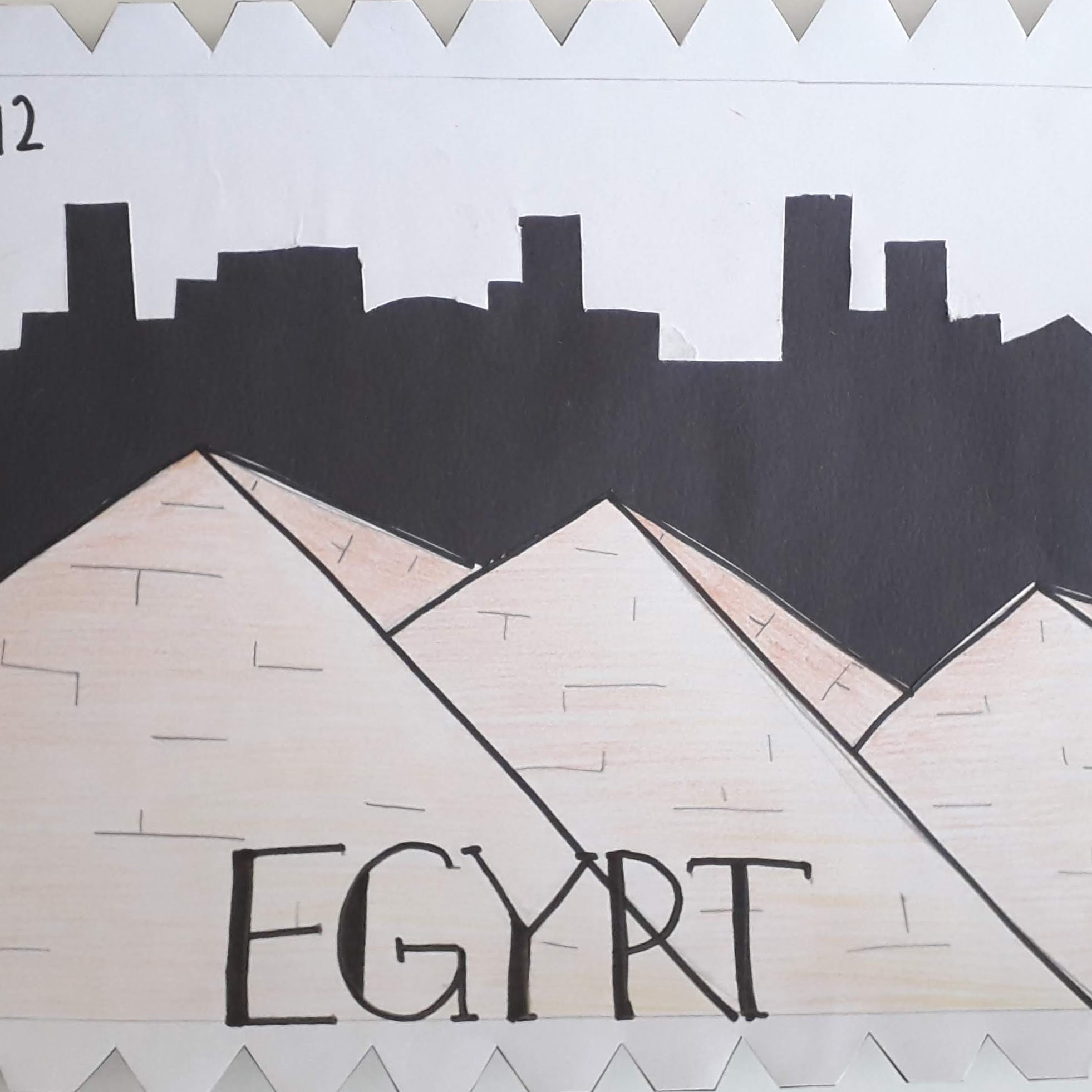
We travelled to a country further east around Christmas time. It is not a country that celebrates Christmas, but this became a good topic of conversation in my classroom. In China, they DO celebrate New Year, which is more similar to what is celebrated here in Turkey.

First and Second Grade:

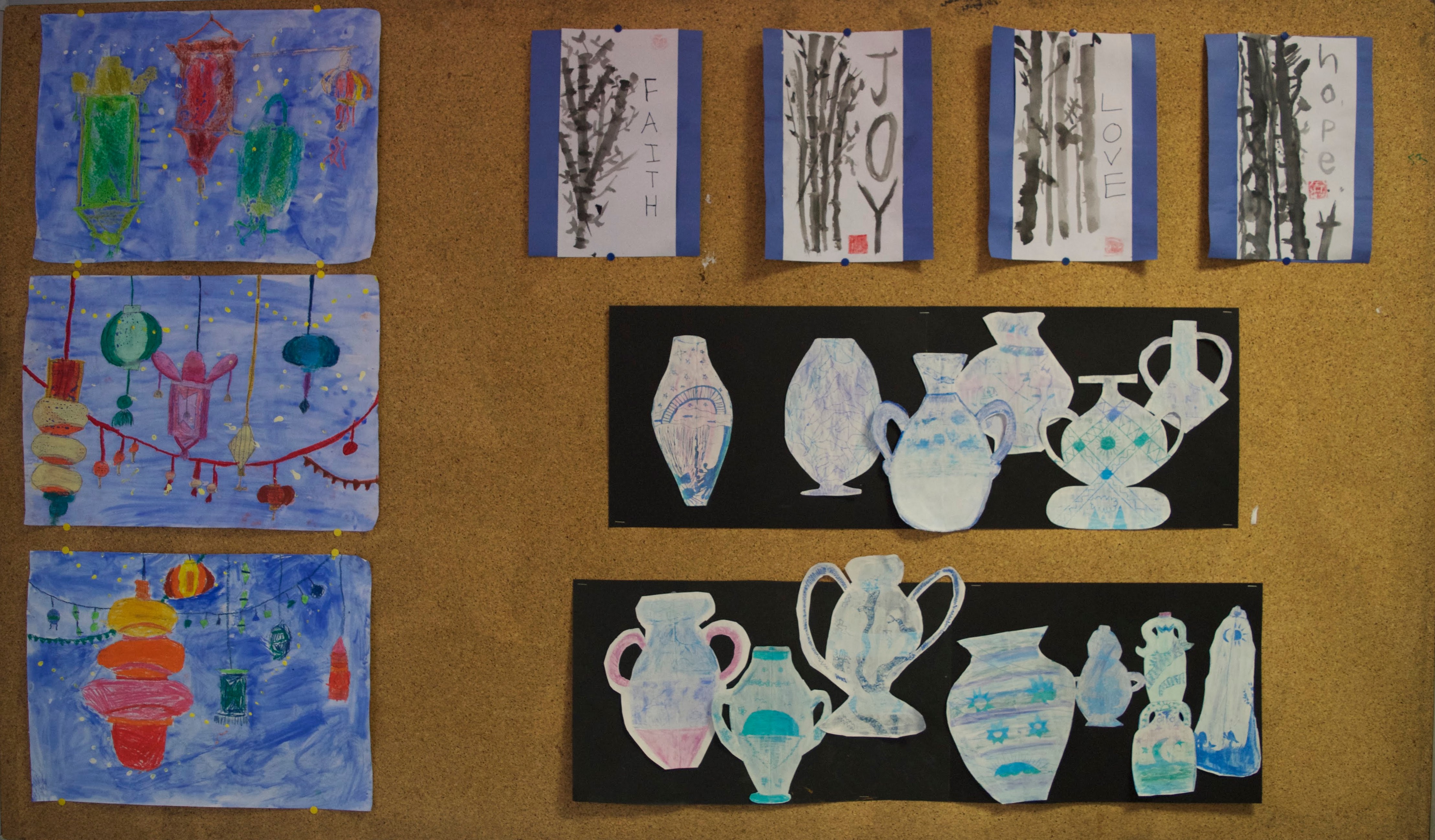
We looked at the Chinese lanterns used in decoration at New Year. First we practiced drawing different types of lanterns in a step by step guided drawing, and later worked independently to create our own composition of lanterns. We discussed drawing to fill the whole space on the page, with bigger lanterns in the front and smaller ones behind.

I introduced my students to value and analogous colours so we could create lanterns that popped off the page. The goal was to get them to use a light, medium and dark version of a colour within one lantern.

After tracing over all of our pencil lines and colouring in each of our shapes, the students painted the background with blue tempera paint. The pastel resists the paint, so we needed to make sure all the white space was coloured in!

The final step was to create dots/strings of light with yellow and white in the background. Students printed these with the end of a paintbrush.

Fourth Grade:

We studied the art of sumi-e brush painting. First we practiced holding the bamboo brush and making different types of strokes. The next class, we put our practice to the test and painted compositions of bamboo. The students chose one word/fruit of the Spirit-love, joy, peace, hope, faith- to write vertically down one side of the paper. Our final class, I had the students design a signature chop (from foam) to sign their finished piece, and then mount the finished works on construction paper.

Fifth Grade:

Fifth graders looked at the art of porcelain Ming vases. We discussed the variety of different shapes and silhouettes. I demonstrated how to create a symmetrical vase drawing with two sides that mirrored each other. These pencil outlines were filled in with different shades of blue pastels. The next class, we painted over the pastel layer with white tempera, and made drawings of design ideas for our vases. During the final class, designs were scratched into the paint to reveal the blue layer underneath. Vases were cut out and mounted together in a composition on black paper.

This slideshow requires JavaScript.

DSC_0015

Decay

This was a unit I did with my IGCSE class in the final weeks of the first semester. I wanted them to have the experience of working with a midterm exam topic to practice working within a limited time, similar to the final exam.

The topic was decay. We began by brainstorming the word, looking at the definition and collecting ideas for subjects pertaining to the topic. I had them do observational drawings of objects, both from my collection and from items they brought in.

After the students had several drawings, we narrowed in to the topic a bit more with a specified task: either to design a fashion garment inspired by decay, or to develop a final piece to be shown in an exhibition on decay. Once the students chose a direction, they began to develop their ideas from their original starting point drawings.

I did a workshop showing them different techniques for distressing paper and fabric to make it look old, worn and decayed. They explored these techniques in their sketchbooks and incorporated some of them into their final ideas.

The final piece was to be created during three one and a half hour exam slots. My students went into the exam knowing exactly which of their ideas they were going to recreate, what materials they needed and had thought out the steps for completion. There was an interruption of snow amidst the creating, so the midterm was not actually finished before the semester ended. Despite this small hiccup, I think all of them were familiarized with the exam process and the steps needed for taking a topic from the brainstorming stages to completion.

Micro>Macro Drawing

I am teaching the Cambridge IGCSE Art and Design course for the second time this year. Once again, I only have four students. I am facing difficulties this year mostly with room scheduling- there is only one art room and two art courses running at the same time (a mostly good problem!) This week was experimental, mixed media drawing; so I decided we would draw on the floor- out on the 5th floor landing. As it is just outside the art room, we had easy access to materials and sinks for clean up. The setting was more relaxed- yoga mats instead of the typical table and chairs- and since more traffic comes through the stairwell, we had more visitors be a part of the excitement.

The students picked from a selection of natural objects to draw. We used bigger sheets of paper- the goal was to zoom in on a section of the object and experiment with materials to replicate the texture. Media attempted for this drawing included charcoal, conte, pastel, watercolour and ink. Following a discussion of the finished results, I had them experiment drawing with thread- stitching overtop of their drawings to create additional texture and interest. I gave them ideas of different embroidery stitches to try and they did the rest. I am so excited to work with this very talented and self motivated group- this is just the beginning!

Artist Treehouse Designs

I tried this project last year with some success- but the results are much better this year with a bit of tweaking 🙂

In preparation, I gave my 6th graders an introduction to both 1 and 2 point perspective, and we did practice drawings of each. We also got out the watercolours and I taught them some different techniques before jumping into the big project.

Task: design a treehouse for a famous artist

Each student chose an artist and received an image sheet of 3-4 artworks. Designers need to get to know their clients in order to create successful designs. I had them start the design process with writing down at least three things they observed when looking at the works. Then students began to sketch ideas, making sure to incorporate these elements of the artist’s style. I also required that they use 2 point perspective somewhere in the work. Once sketches were approved, students moved onto their good copies, which were painted with watercolours.

Can you guess which artists these homes are designed for?

Lines of Explosion and Colour

exp1
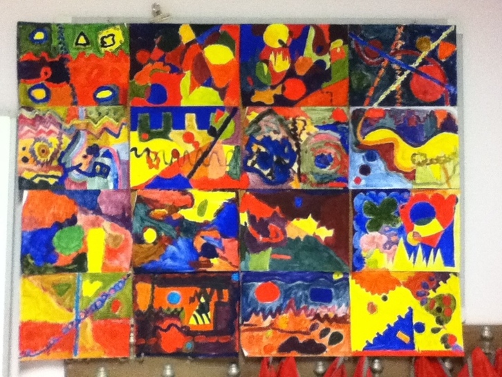
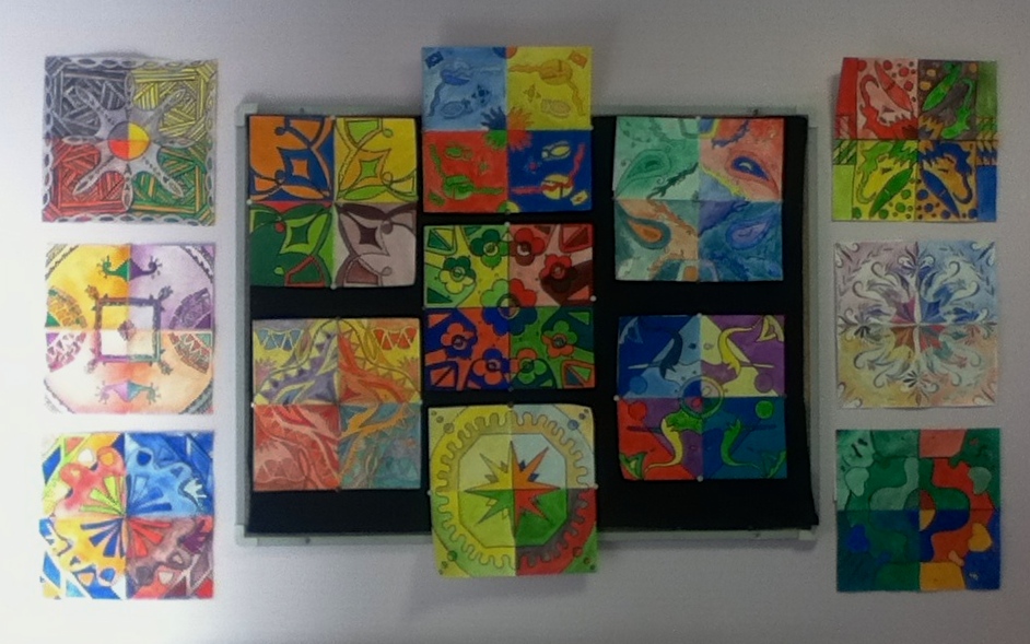
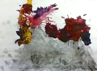
Yesterday was a good day in the art room. I got to watch and assist the third grade class in making explosive volcanoes with charcoal and paint. Nothing like a good bit of creative mess to start out the day- a few of these kiddos are bound to be artists! I received some confidence boosting words of encouragement from fellow staff that I am doing good work with the students, which I doubt at times. I also finished a few projects with classes and had to find new spaces to hang them.

It is a problem to run out of gallery space as an art teacher!

I attempted wire drawing with high school again, as I think it is a great beginning exercise for using line to create space. This time, I decided to hang the pieces instead of having them stand as sculptures. They may look like ordinary line drawings, but this way we can see the beautiful shadows behind!

This slideshow requires JavaScript.

The sixth graders have been learning about colour and painted some very expressive, abstract paintings using a variety of lines, organic and geometric shapes.

exp16

Colour Scheme Tile Designs

As a first project with a new class of the semester, I had the opportunity to try something new! These tile designs turned out beautifully- it was the perfect project for reviewing several art elements and getting everyone on the same page.

This slideshow requires JavaScript.

tile14

It took me FOREVER to hang these, with an odd number of paintings and a bulletin board that is too small. I take hanging artwork very seriously, perfection is essential for presentation!

Exploring Natural Forms: Repetition+Variation

Part A of a two part project. Students chose a natural object from my own collection to explore and worked in their sketchbooks at first to test out different mixed media combinations. They chose limitations for their piece in regards to the layout of their compositions and media, and created a grid of twelve compositions. These compositions were to show repetition and variation in exploring an object and throughout the piece as a whole.

I am so very proud of what they have accomplished and how far they have come!

And of course, I had to try it out for myself!